| Image |
Comment |
| 07/26/2013 05:01:47 AM |
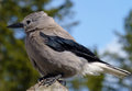
Birdby albrixComment by Kroburg: I like your bird pictures (the Hey Bird was nice as well), but this one is stunning. Very good exposure, great focus and sharpness and a lovely background. Maybe a nice on for the July FS? |
| 07/26/2013 04:59:20 AM |
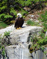
Eagleby albrixComment by Kroburg: Wow, how close was this one? I think you should try to crop this one (focusing on the eagle) and try to bring out more details in the darker part of the feathered body. |
| 07/26/2013 04:57:02 AM |
|
| 03/28/2013 10:35:21 PM |
|
 Photographer found comment helpful. Photographer found comment helpful. |
| 03/25/2013 06:45:17 PM |
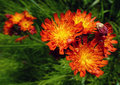
Taste me!by albrixComment by pforg: I like the composition of this but feel it needs more contrast to draw the eye more. |
| Photographer found comment helpful. |
| 02/26/2013 04:28:42 AM |
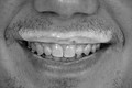
My Buttermilk Heroby albrixComment by smardaz: Greetings from the Critique Club.
My initial thoughts on this are that I am often off-put by these type of shots, but seperating myself from that, I think you did a good job composing this and filling the frame. I think what hurt this shot, accounting for the score, was the nose being out of focus. For a shot like this, you really want all parts of the image to be tack sharp.
Also, the black and white tones could use some more contrast as they look a little flat. Also as was mentioned, the stubble does not help in this case.
I noticed you wanted comments on the vignetting and to be honest I don't see any. If you added any, it's very subtle. I don't think this is the type of shot that would benefit from a vignette. If you take a look at stock photography for this type of shot you wouldn't see that, you made a good choice where that is concerned.
Don't be too discouraged by the placing and the score, we've all had them. This is how we grow as artists, keep shooting!
Jason |
| Photographer found comment helpful. |
| 02/20/2013 07:53:37 AM |
|
| Photographer found comment helpful. |
| 02/20/2013 12:56:12 AM |
|
| Photographer found comment helpful. |
| 02/19/2013 10:20:11 PM |
|
| Photographer found comment helpful. |
| 02/18/2013 11:00:24 AM |
My Buttermilk Heroby albrixComment by dtremain: Keep in mind this is a critique of the picture, not of the photographer. Crop - I think you've chosen well for the crop - enough space left, right, top, and bottom - nose gives additional context, even though it is cut off. Vignetting - not enough to be a visually significant factor.
I think three things that really hurt your score are:
No white whites - yeah, I know buttermilk isn't white, but since it is in b & w, you could make it look white. As it is, the "whitest" part of the pictures looks like a very unattractive (even repulsive - especially on teeth) grey.
Lighting - I am no expert on lighting, but the picture's lighting makes this look like a dentist shot, with wet, icky teeth - pulling attention away from the milk-stache.
Stubble - little sprouts of facial hair are not attractive - either clean shaven, or a nicely trimmed mustache would work better.
|
| Photographer found comment helpful. |
Home -
Challenges -
Community -
League -
Photos -
Cameras -
Lenses -
Learn -
Help -
Terms of Use -
Privacy -
Top ^
DPChallenge, and website content and design, Copyright © 2001-2025 Challenging Technologies, LLC.
All digital photo copyrights belong to the photographers and may not be used without permission.
Current Server Time: 03/10/2025 04:30:09 PM EDT.