| Image |
Comment |
| 02/03/2004 03:36:18 AM |
Jack & Cokeby spydrComment by siggi: hmm, I'm not much of a whiskey fan but isn't it best on the rocks - whiskey and ice? Very mystic blue color hope you tell us about the makeing of this picture.
What is it sticking into the picture from the lower right? Very nice setup. |
 Photographer found comment helpful. Photographer found comment helpful. |
| 02/02/2004 08:07:50 PM |
|
| Photographer found comment helpful. |
| 02/02/2004 07:06:04 PM |
|
| Photographer found comment helpful. |
| 02/02/2004 03:41:26 PM |
Jack & Cokeby spydrComment by fredroj: nice picture...would have been great the other way around (instead of negative). nice detail in the picture! |
| Photographer found comment helpful. |
| 02/02/2004 12:41:22 PM |
Jack & Cokeby spydrComment by Olyuzi: I like the blue colors but they look as if they've been post processed too much leaving dirty looking ice and glass and a black reflection of the whiskey bottle in the coke bottle. Plus, your colors look too blotchy. |
| Photographer found comment helpful. |
| 02/02/2004 12:40:09 PM |
Jack & Cokeby spydrComment by drgsoell: The color shifting makes the bottles look all mottled and dirty and the drink unappetizing. Good combination, but the effect does not work for me. |
| Photographer found comment helpful. |
| 02/02/2004 01:35:25 AM |
Jack & Cokeby spydrComment by MrAkamai: Looks like an infrared filter was used here. Very creative and definitely out of the ordinary! It give the picture a spooky glow and I really like it! 10! It has good focus and all that other stuff, too. |
| Photographer found comment helpful. |
| 01/19/2004 12:12:15 PM |
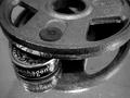
More of this...Less of that!by spydrComment by JC_Homola: Greatings from the Critique Club.
I think this is a very well done image. I like the concept, use of Black and White, the mirror.
The composition could use a little tweaking. Possibly a little less negative space, right foreground. THe DOF is right on.
Well done in my opinion.
JC |
| Photographer found comment helpful. |
| 01/13/2004 01:22:05 AM |
|
| Photographer found comment helpful. |
| 01/11/2004 07:40:52 AM |
|
| Photographer found comment helpful. |
Home -
Challenges -
Community -
League -
Photos -
Cameras -
Lenses -
Learn -
Help -
Terms of Use -
Privacy -
Top ^
DPChallenge, and website content and design, Copyright © 2001-2025 Challenging Technologies, LLC.
All digital photo copyrights belong to the photographers and may not be used without permission.
Current Server Time: 04/21/2025 06:40:03 AM EDT.