| Image |
Comment |
| 01/31/2005 04:45:09 PM |
|
| 01/27/2005 07:59:05 PM |
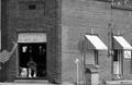
Minimallby tomtitusComment by ahaze: Odd but cool in a slice-of-Americana kind of way. Would be interesting to see different crops- including the entire rightmost awning but cropping out the bit of sky in the upper right. My eye keeps going there as a "way out" of the photo. |
| 01/22/2005 07:34:59 AM |
Minimallby tomtitusComment by Skip: love the composition and the story the image tells. wish it was a little sharper, though. good luck! |
| 01/20/2005 01:58:51 PM |
Minimallby tomtitusComment by willem: closer please, even if you do want to show the overall context. I would like to see the person better, I think he is part of the story. |
 Photographer found comment helpful. Photographer found comment helpful. |
| 01/20/2005 10:34:16 AM |
Minimallby tomtitusComment by notonline: Nice shot. The contrast on the awings make this photo really hard to look at. It also looks a tad on the blurry side. Keep up the good work and best of luck in 2005. |
| Photographer found comment helpful. |
| 01/19/2005 08:47:50 PM |
Lightscapeby tomtitusComment by mycelium: Greetings from the Critique Club!
Ah, the lengthy-motion-blur-caused-by-driving-at-night technique. It's a fun one. I'm guessing that this is one of several that you took during this particular outing and selected this one from them. The colors and lines are interesting, which shows that you've got a good eye for composition. The problem is that, at root, this is the sort of photograph that probably everyone takes at one time or another, and the more of them you see, the more you realize that they all look pretty much the same. Unfortunately, there is very little to meaningfully distinguish between most pictures of this sort of thing- they are all streaks and blobs of light with very little form.
Also, the challenge was about the out-of-focus elements of the background, and the whole image here is a blur. It doesn't actually meet the challenge well at all.
I looked at some of your profile photographs (what are those-herons?) and those looked good to me. You also have an excellent camera, so it seems like you're in generally good shape. Just keep taking pictures! |
| Photographer found comment helpful. |
| 01/18/2005 09:34:50 AM |
Minimallby tomtitusComment by jonpink: Think a waste op here, man looks like a good subject and I would have gone in close. |
| 01/17/2005 05:27:55 PM |
Minimallby tomtitusComment by samtrundle: I like what you are trying to do here - but it's missing something - I think the lighting on the right side is a little harsh - and then the shadows in the doorway are a bit strong - I'd like to get a better idea of what that person is doing. |
| 01/16/2005 11:30:29 AM |
Lightscapeby tomtitusComment by ButterflySis: It seems the enter image is a blur. My understanding is that bokeh is the blur of either the fg or bg. I don't see that here. |
| 01/15/2005 04:18:23 PM |
Lightscapeby tomtitusComment by Skip: ouch. i'm not sure what you were after here. this is interesting, but i don't think it is much of a challenge entry. |
Home -
Challenges -
Community -
League -
Photos -
Cameras -
Lenses -
Learn -
Help -
Terms of Use -
Privacy -
Top ^
DPChallenge, and website content and design, Copyright © 2001-2025 Challenging Technologies, LLC.
All digital photo copyrights belong to the photographers and may not be used without permission.
Current Server Time: 03/12/2025 10:22:14 PM EDT.