| Image |
Comment |
| 04/08/2004 07:54:28 PM |
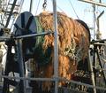
Reel em in!by LtHousLadyComment by Klauss: first of all this shot is torn apart in two parts by the metallic bar; secondly... i can't "read" the story behind this shot... |
 Photographer found comment helpful. Photographer found comment helpful. |
| 04/08/2004 02:51:49 AM |
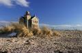
Golden Tranquilityby LtHousLadyComment by LtHousLady: Thank you all for the comments. As you can see, I stink at all other photography cept LIGHTHOUSES! lol Well, maybe not all, but I definitely do better with something I'm passionate about.
Might have pulled a slightly higher ranking if I had used THIS CROP but I couldn't stand to let the great texture of the rocks & sand be left out.
Yes, I did use a polorized lense. I almost always do for the lighthouses. Even with using it, the originals are still lacking in color... ORIGINAL
I always up the saturation in the camera software before bringing it into Photoshop to fine tune.
On a happy news note, I just found out that the alternate cropping version is going to be in a local magazine, Long Island Parenting News Needless to say, I'm VERY happy :o) |
| 04/08/2004 12:49:05 AM |
|
| Photographer found comment helpful. |
| 04/08/2004 12:43:49 AM |
|
| Photographer found comment helpful. |
| 04/08/2004 12:14:28 AM |
Golden Tranquilityby LtHousLadyComment by TooCool: I guessed that you took a shot in this challenge, but it wasn't this one! :-P
Very nice shot. You made it into my favorites!
TC |
| Photographer found comment helpful. |
| 04/07/2004 04:42:57 PM |
|
| Photographer found comment helpful. |
| 04/07/2004 02:46:47 PM |
|
| Photographer found comment helpful. |
| 04/07/2004 09:03:27 AM |
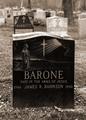
Too Young to Belongby LtHousLadyComment by undieyatch: I was impressed with the image. I love the monotone - the colour of the black stone and sepia tone - the contrast is visually strong and conveys your emotion well. The straight ahead composition is totally appropriate and tells the story in a clear concise way. I am impressed with your choice to shoot straight on. With emotion, there is always a temptation to layer or look for a unique angle of view when often a straight view of the object can provide the most clairity. There is no way to miss the message, even a detractor like lockjawdavis admits to this. I find that the picture has some interesting visual elements. The little stone on the Barone memorial, it seems is there for a reason, and to me it contributes to my imaginary story of this picture. The placement of headstones back to back is another unusuall visual element that makes me take a longer look. It is a strong image and I see that I gave it a six. Now that I have read your photographer comments in the picture, I'd like to convey my best wishes to you in your effort to heal and understand the tragedy of your nephew. Your picture will be a valuable addition to your family album. |
| Photographer found comment helpful. |
| 04/07/2004 07:00:56 AM |
Too Young to Belongby LtHousLadyComment by e301: Of course there is sadness in the death of a child, that almost goes without saying.
Your photo, however, is really very blunt. It is entirely a portrait of a tombstone - what sense of location there is is simply entirely of a graveyard, exactly as one would expect, and makes no contrast, comment or difference to the view of the stone. As a study of the texture of the stone, the light is not useful - there is little sense of smoothness, or roughness, and the framing and depth of field does not allow for a perception of contrast with the grass, trees, and what surroundings are visible. This is what I mean by 'blunt' ... there is nothing else going on here, in photographic terms.
Had it been my own project, I think I would have tried to show something of the atmosphere of the cemetary/graveyard, or perhaps tried to contrast the heaviness, solidity and smoothness of the stone with the surrounding grass, leaves, or whatever. Those choices would depend on the nature of the location. Colour might have been effective in that task - it seems to be a black stone, and to contrast that with a vibrant green in the grass, or perhaps the leaves of the tree (shooting upwards from the ground), might have made colour a good choice for the shot - black and white is not necessarily the only way to 'do' sombre moods.
Just some thoughts.
Ed
|
| Photographer found comment helpful. |
| 04/07/2004 05:19:58 AM |
Too Young to Belongby LtHousLadyComment by BobsterLobster: Originally posted by lockjawdavis:
Overwrought for me. What is photographically interesting here other than the sentiment? |
Interesting... I thought this comment really should be the most useful for you. |
| Photographer found comment helpful. |
Home -
Challenges -
Community -
League -
Photos -
Cameras -
Lenses -
Learn -
Help -
Terms of Use -
Privacy -
Top ^
DPChallenge, and website content and design, Copyright © 2001-2025 Challenging Technologies, LLC.
All digital photo copyrights belong to the photographers and may not be used without permission.
Current Server Time: 04/07/2025 12:32:50 AM EDT.