| Image |
Comment |
| 10/10/2005 09:45:39 AM |
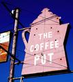
the coffee potby arlanbartComment by RKT: Great...super great in fact...the colors couldn't be any better if they tried...excellent shot. |
 Photographer found comment helpful. Photographer found comment helpful. |
| 10/09/2005 05:07:51 PM |
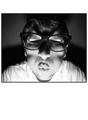
Birthdayby arlanbartComment by karmat: CRITIQUE CLUB CRITIQUE
by karmat
This is too freakin' hilarious. It's scary, in a funny kinda way, and definitely looks like a good birthday card.
I really like the bw you have chosen to use, and the shadows help to add to the comical/scary effect. The expression on the face (especially with the big "X" shadow across the eyes/nose is priceless) the exposure is good and the focus works for me.
The only thing I think that may detract from the overall effect is what you have chosen to use as a border. Obviously, it *should* not effect the picture, but in this case, it makes the actual picture smaller than it could have been. Also, all the "white" around the picture draws the eyes (and thus viewer's attention) away from the shot. While I assume that you are going for the "card" look, it may have been helpful to "drive" the viewers' eyes to the picture not away from it.
Good work, and best to you in future challenges.
karmat |
| Photographer found comment helpful. |
| 10/09/2005 02:09:45 PM |
|
| Photographer found comment helpful. |
| 10/09/2005 03:50:13 AM |
the coffee potby arlanbartComment by metoecus: The contrast between the sign and the deep blue sky is good, but frankly I find the color of the sky the most interesting part of this image. |
| Photographer found comment helpful. |
| 10/07/2005 09:55:12 PM |
|
| Photographer found comment helpful. |
| 10/07/2005 12:55:44 AM |
the coffee potby arlanbartComment by ace flyman: Great colors, nice and sharp..............5 doesnt meet the challenge in my opinion, wouldn't find this "in" a coffee shop.....but well done |
| Photographer found comment helpful. |
| 10/06/2005 10:02:25 PM |
the coffee potby arlanbartComment by Rikki: I think the use of a CPL (if you did use one) is a bit too much in this image. The sky is eerily smooth and uniform. This could have probably used a bit of contrast or elevsl to bring some colors out. 6 |
| Photographer found comment helpful. |
| 10/06/2005 09:41:22 PM |
the coffee potby arlanbartComment by ibkc: Color of the sky strikes me as a little too deep of a blue, giving away it's photoshopped nature. At least I assume that's photoshop...if not, I want to move to where you took the picture. But overall this is one of the better pics in the challenge. I give it a 7. |
| Photographer found comment helpful. |
| 10/06/2005 08:38:13 PM |
|
| Photographer found comment helpful. |
| 10/06/2005 02:27:54 PM |
the coffee potby arlanbartComment by tpoc: what a great sign! because the red is so faded, and the blue sky so saturated, i would be interested in seeing how this photo would look converted to a b&w. i like the composition of the photo, but the saturated sky seems to overwhelm the picture. |
| Photographer found comment helpful. |
Home -
Challenges -
Community -
League -
Photos -
Cameras -
Lenses -
Learn -
Help -
Terms of Use -
Privacy -
Top ^
DPChallenge, and website content and design, Copyright © 2001-2025 Challenging Technologies, LLC.
All digital photo copyrights belong to the photographers and may not be used without permission.
Current Server Time: 04/19/2025 08:35:37 AM EDT.