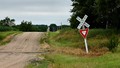
No lights, no bells, no gates: only common senseby
ZitaComment by salmiakki: Greetings from the Critique Club
Sorry to see this didn't do a bit better. I think with a bit of extra post processing before entering it could have scored a bit higher than it did.
Subject: Clearly meets the challenge, although perhaps not the most interesting signs.
Composition: I think the composition could be more dynamic. The aspect ratio 16:9 does not, at least for me, work too well with this image. I would be inclined to have cropped it to a more traditional 3:2 ratio. There is no real detail in the dark trees to the right, so you could crop part of the trees away. At the same time, you could afford to lose some of the out of focus grass in the foreground. The road adds a nice line leading us through the image.
Exposure: The image feels a little underexposed. I suspect this was a choice to avoid blowing out the sky, so easy to do when the sky is like this. The light overall is very flat and I think this is probably the main reason for the sub 5 score. I can imagine if this were shot on a day with sun, puffy white clouds etc that it would score a lot better. I don't know what sort of photo editing software you use, but I feel with some simple editing you could have lifted this image a bit and lost the "flat" feeling. A levels/curves adjustment in editing software, brightening the mid tones particularly would help. I have the Nik/Google collection of plugins and use detail extractor quite a lot when the light is like this. It can help. I'd also be tempted to add a sunlight/skylight filter to boost the image. All very lightly applied so it doesn't look like it's "glowing" and lacking in focus.
Hopefully this helped a bit explain my opinion on why I thought it fell short in this challenge.