| Image |
Comment |
| 05/15/2004 12:36:03 PM |
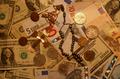
the Big oppositesby mrBlueComment by melismatica: The color could have used some balancing to tone down the extreme yellow cast of the lighting. The
arrangement is busy and uninteresting. |
 Photographer found comment helpful. Photographer found comment helpful. |
| 05/15/2004 01:02:03 AM |
the Big oppositesby mrBlueComment by taterbug: nice idea. i think the lighting is lacking something. maybe try either more shadowy, or more even lighting. the bright spot in upper right corner is a little distracting. |
| Photographer found comment helpful. |
| 05/14/2004 11:39:46 PM |
|
| Photographer found comment helpful. |
| 05/14/2004 04:18:57 PM |
the Big oppositesby mrBlueComment by sailracer_98: The lighting on this picture looks "off". A different white balance setting may help remove the yellowish tint cast over the image. |
| Photographer found comment helpful. |
| 05/14/2004 03:59:49 PM |
|
| 05/12/2004 10:42:44 PM |
the Big oppositesby mrBlueComment by Nelzie: The shot seems a little dark. Perhaps if there was a little more light the vibrant colors of the money might have popped out a bit more. Good take on the challenge. |
| Photographer found comment helpful. |
| 05/12/2004 02:24:44 PM |
the Big oppositesby mrBlueComment by Falc: So why did I give this a 3 ?
Well, its 'flat' there is no depth, no texture, the lighting doesn't make the cross stand out, in fact it almost recedes into the notes. The orange 'tint' just reminds me of a tungsten white balance problem, The shiny coin takes too much attention because its the only shiny thing in the frame, and I guess its not supposed to be the main point of interest.
Sorry for the score, but I hope that helps to explain why I marked it doen. |
| Photographer found comment helpful. |
| 05/12/2004 10:13:48 AM |
|
| 05/12/2004 03:48:16 AM |
|
| 05/12/2004 02:05:01 AM |
the Big oppositesby mrBlueComment by bayonic: faith and wealth .... not sure theyr'e opposites .... just ask your friendly TV evangelist.
i thought the photo could use a bit more brightness and contrast tweaking .... gotta love the counterfeit measures on the euro notes tho
5 |
Home -
Challenges -
Community -
League -
Photos -
Cameras -
Lenses -
Learn -
Help -
Terms of Use -
Privacy -
Top ^
DPChallenge, and website content and design, Copyright © 2001-2025 Challenging Technologies, LLC.
All digital photo copyrights belong to the photographers and may not be used without permission.
Current Server Time: 03/12/2025 09:26:46 AM EDT.