shortcutby
spidermanComment by stephan: Greetings from the Critique Club, John.
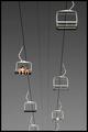
Composition: The composition is very strong. I like the simplicity. For example clouds in the sky would have been very distracting in my opinion. The diagonal lines draw your attention to the bottom of the photo. I think it's good as it is now but I wonder how it would look like if the people would sit in the chair on the right lane near the bottom.
Lighting: Exposure is good. The selective desaturation is subtle but fits very well. This is the "icing on the cake".
Focus: The narrow aperture was a good choice. I think a shallow DOF where maybe some of the seats have a softer focus wouldn't look as good as it's now.
Challenge: I think this is the weak part of the photo. Don't get me wrong. It is technically a great photo and in my opinion it also fits to the challenge. But when you look at some of the other top-photos (e.g. the winner) then you see that there is a great contrast regarding the subjects. I see contrasts in your photo, too. E.g. the empty seats vs. the two people and also colour-wise, but it's a bit too subtle to be recognised immedeatly and also not very strong (as compared to for example the hands of the winning photo).
Creativity: Well, the photo certainly does not look like just a snapshot. The composition and the selective desaturation sure shows creativity.
Ok, I probably couldn't help you very much. But this is also because your photo would have been a 10 in my book. It's hard to write a CC critique for good photos :)