| Image |
Comment |
| 11/05/2004 09:02:31 AM |
|
 Photographer found comment helpful. Photographer found comment helpful. |
| 11/04/2004 08:20:52 AM |
|
| Photographer found comment helpful. |
| 11/04/2004 04:18:39 AM |
Color Panesby dclarkeComment by terje: Great! Lovely color, well saturated and a fun and fresh composition, typical favorite shot. GL |
| Photographer found comment helpful. |
| 11/03/2004 06:26:13 PM |
|
| Photographer found comment helpful. |
| 11/03/2004 01:28:42 PM |
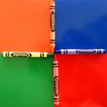
Color Panesby dclarkeComment by cbeller: cute idea. the lighting is a litle harsh, particularly on the green crayon. There also appear to be dust spots (white dots) that could have been cleaned out with the Healing Brush. Good luck. |
| Photographer found comment helpful. |
| 11/02/2004 11:46:34 PM |
|
| Photographer found comment helpful. |
| 11/02/2004 10:20:34 PM |
|
| Photographer found comment helpful. |
| 11/02/2004 03:44:45 PM |
|
| Photographer found comment helpful. |
| 11/01/2004 08:21:32 AM |
Color Panesby dclarkeComment by wlevy: Nice idea, this almost works... it bugs me that the blue and red crayons are a little mis-aligned. |
| Photographer found comment helpful. |
| 10/26/2004 09:13:03 AM |
Math Homeworkby dclarkeComment by nephrotic: My first thoughts were that it looked like a good product shot and had commercial potential - but the triple shadow particularly visible on the calculator spoils it. A soft diffused light top left to get rid of all but the main shadow would make a huge difference. I removed the shadow in PS and it does let the eye concentrate on the other components.
I would like to see an original print. I think that as this would be good commercially - I would think !what is the important part" For me the "texas instruments" text. It seems slightly out of focus and I would get that part pin sharp. |
| Photographer found comment helpful. |
Home -
Challenges -
Community -
League -
Photos -
Cameras -
Lenses -
Learn -
Help -
Terms of Use -
Privacy -
Top ^
DPChallenge, and website content and design, Copyright © 2001-2025 Challenging Technologies, LLC.
All digital photo copyrights belong to the photographers and may not be used without permission.
Current Server Time: 03/12/2025 10:40:39 PM EDT.