| Image |
Comment |
| 05/18/2004 09:14:20 PM |
|
| 05/18/2004 04:41:41 PM |
|
| 05/18/2004 01:35:19 PM |
|
| 05/17/2004 09:17:20 AM |
|
| 05/15/2004 10:29:59 AM |
|
| 05/15/2004 02:12:31 AM |
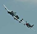
The Old and The Newby ronlcoxComment by CDS: Neat subject and nice colors of the sky. There appears to be a lot of digital 'noise' around the subjects. I am also seeing interpolated pixels (square blocks) in the upper right. This typically indicates the use of digital zoom or post processing pushed too far. |
| 05/14/2004 03:39:09 PM |
The Old and The Newby ronlcoxComment by psweetkity: good composition, but not crazy about the square crop, the planes need room to move in the frame, they look like they are traped. |
| 05/14/2004 12:26:01 PM |
|
| 05/14/2004 12:01:19 PM |
The Old and The Newby ronlcoxComment by cghubbell: Not sharp enough for my liking, and a bit too small to really enjoy. It is a great opposites image though, and as a plane buff I find it has interest to me on that level as well. |
| 05/14/2004 12:47:37 AM |
The Old and The Newby ronlcoxComment by 16point2mm: While I think the concept is certainly solid, the color pallette is a bit too flat for my taste (stronger saturation, maybe?), and I also feel that this is one of those rare instances that I would want to see some motion blur on the subjects, just to get across the fact that they really aren't just hanging models. That's a personal choice though. |
Home -
Challenges -
Community -
League -
Photos -
Cameras -
Lenses -
Learn -
Help -
Terms of Use -
Privacy -
Top ^
DPChallenge, and website content and design, Copyright © 2001-2025 Challenging Technologies, LLC.
All digital photo copyrights belong to the photographers and may not be used without permission.
Current Server Time: 03/12/2025 02:07:15 AM EDT.