| Image |
Comment |
| 04/04/2006 07:03:59 PM |
backby haakkyComment by Krisby: when i look at this again i see how lovely it really is.. this is very well done and might i say your back is quit lovely :) but i still am on the opinion that i would like to see eighter more or less of you tattoo.. But nice work gave you a 8 by the way ;) |
| 04/03/2006 06:19:25 PM |
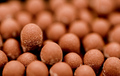
got match?by haakkyComment by KarenNfld: I like the DOF and I like the fact that you chose to have one match head sticking up a little from the rest. Pretty neat. |
 Photographer found comment helpful. Photographer found comment helpful. |
| 03/30/2006 04:10:09 AM |
|
| Photographer found comment helpful. |
| 03/30/2006 01:06:15 AM |
got match?by haakkyComment by taterbug: Oh, what a great job on lighting here. Awesome texture in the shot. I'm wondering if maybe just a slightly deeper dof could be more effective? Maybe not? Cool shot though, nice idea. |
| Photographer found comment helpful. |
| 03/29/2006 03:16:12 PM |
|
| Photographer found comment helpful. |
| 03/29/2006 11:32:48 AM |
got match?by haakkyComment by bod: First glance: D'oh, the answer's in the title!
A little too little DoF. |
| Photographer found comment helpful. |
| 03/29/2006 11:20:55 AM |
got match?by haakkyComment by ericwoo: Identifiable, and the focus seems to be in the worng location. I do like the shallow DOF, but I would have focused around the standing match. |
| Photographer found comment helpful. |
| 03/28/2006 01:22:36 PM |
backby haakkyComment by PS_nl: Nice use of shadows here, great how they capture his muscles. I would have work the tattoo away though |
| 03/28/2006 09:58:28 AM |
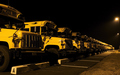
all lined up, ready for the next morningby haakkyComment by sfalice: Greetings from the Critique Club
When this image popped up on my screen in the random selection that we get here at the Critique Club, I thought "oh, this is the one I liked!" and sure enough, my vote was one of your four 10s. So, I'm going to be a bit prejudiced about critiquing this image.
I loved the dark, ominous mood of this well composed image. And if you did it handheld, more power to you. It is as crisp as it needs to be to maintain that mood. If I had to nitpic, (and it would be a nitpic) I'd suggest that if you had composed your shot to eliminate the lights at the right border, it would have eliminated an unnecessary attention getter.
Other than that, your score must have been a matter of personal like or dislike for our voters, as the image meets the Challenge perfectly and is technically and artistically well done (IMO).
Keep up the good work. |
| Photographer found comment helpful. |
| 03/28/2006 07:27:32 AM |
backby haakkyComment by Krisby: that's nice.. think the tattoo drags it down a bit.. other wise well done |
Home -
Challenges -
Community -
League -
Photos -
Cameras -
Lenses -
Learn -
Help -
Terms of Use -
Privacy -
Top ^
DPChallenge, and website content and design, Copyright © 2001-2025 Challenging Technologies, LLC.
All digital photo copyrights belong to the photographers and may not be used without permission.
Current Server Time: 03/12/2025 02:34:17 AM EDT.