DPChallenge: A Digital Photography Contest You are not logged in. (log in or register
 
Browse Settings
Currently viewing:
Registered UserFyzarl

Show comments:

Per page:

Order:

Comments:


Comments Received by Fyzarl
Pages:   ...
Showing 41 - 50 of ~428
Image Comment
rabbit nation
01/04/2006 06:10:01 PM
rabbit nation
by Fyzarl

Comment by Wessy:
The light is amazing and the shape is very nice too......
Photographer found comment helpful.
rabbit nation
01/04/2006 05:13:08 PM
rabbit nation
by Fyzarl

Comment by kari1:
The way this is lit really does make this shot work.
Photographer found comment helpful.
Mantis
12/07/2005 10:14:37 PM
Mantis
by Fyzarl

Comment by nsbca7:
Background is distracting.
Photographer found comment helpful.
Mantis
12/05/2005 12:51:03 PM
Mantis
by Fyzarl

Comment by loseme:
Awesom shadow, the background is lovely.
Photographer found comment helpful.
Mantis
12/05/2005 11:10:15 AM
Mantis
by Fyzarl

Comment by photom1946:
nice, but.....background takes away from it being REALLY nice.
Photographer found comment helpful.
Mantis
12/04/2005 01:20:04 AM
Mantis
by Fyzarl

Comment by whatdewuc:
Wonderful and first manty silhouette I've seen on dpc.DOF is critical here and you nailed it. Border works well. Good luck on your entry. -9-
Photographer found comment helpful.
Mantis
12/03/2005 12:51:35 PM
Mantis
by Fyzarl

Comment by Bud:
Nicely done, usually do not see macros as silouettes.
Photographer found comment helpful.
Mantis
12/02/2005 09:10:14 PM
Mantis
by Fyzarl

Comment by deapee:
This is a great idea and great subject. Unfortunately, i'm sure a lot of people mentioned the blown out background...which is super distracting. If the background was a single shape, even if it was blown out, this would be more effective...and you could use it for your composition -- ie, your placement of what where.
Photographer found comment helpful.
Mantis
12/01/2005 01:32:49 AM
Mantis
by Fyzarl

Comment by tsheets:
great silhouette. Nice detail on the mantis and the branch he is on.
Photographer found comment helpful.
colorism 2
11/28/2005 05:21:59 PM
colorism 2
by Fyzarl

Comment by funnylooks:
Hello from the Critique Club!

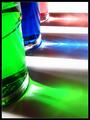
Firstly, congrats on the top ten finish! I love the colours and the shine of this picture.

I really love the composition, and the border definetly adds to the vibrancy of the photo. One possible suggestion (and I'm not quite sure if it'd add to the photo or not), cropping the photo at the bottom so it's all green - cutting out the bit of white down there. I get the impression that it'd make the pic look a bit more grounded...

The DOF is great, though I did notice that the top left, the upper green glass, is the only part that seems to be a bit out of focus.

One other detail is that whatever you used as white underneath seems to have little dust specks that show up. With a picture this clear, i think it'd be nice to have a purer white.

I love the play of light in each of the coloured shadows. In the green it seems to come from a bit of a different angle, which seems a bit odd because the red and the blue are very much the same.

All together, I'd say this is a beautiful picture though. And once again, congrats on the top 10 finish!

--Mariana

Feel free to PM me with questions/comments.

Photographer found comment helpful.
Pages:   ...
Showing 41 - 50 of ~428


Home - Challenges - Community - League - Photos - Cameras - Lenses - Learn - Help - Terms of Use - Privacy - Top ^
DPChallenge, and website content and design, Copyright © 2001-2025 Challenging Technologies, LLC.
All digital photo copyrights belong to the photographers and may not be used without permission.
Current Server Time: 03/12/2025 10:45:21 AM EDT.