| Image |
Comment |
| 07/05/2006 06:44:01 AM |
|
 Photographer found comment helpful. Photographer found comment helpful. |
| 07/04/2006 11:42:28 PM |
|
| Photographer found comment helpful. |
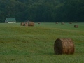
| 07/04/2006 09:33:15 AM |
Country Morn'by rayg544Comment by neophyte: I really like the hazy effect here. It adds to a nice comp and a DOF that draws you in. Looks like you picked a perfect time of day to take this. Nice job. |
| Photographer found comment helpful. |
| 07/03/2006 09:52:13 PM |
|
| Photographer found comment helpful. |
| 07/03/2006 03:37:19 PM |
|
| Photographer found comment helpful. |
| 06/16/2006 07:58:53 PM |
Country Roseby rayg544Comment by Phil: Greetings from the Critique Club Raymond.
A lovely shot of the rose. Crisp. clear and what can I say about the beautiful color other than.....well.....beautiful.
A few things hurt your score here. I see where you were going with this but the angle of the shot really got into your composition. The rose seems more like it's blocking a decent subject rather than grabbing my attention as the main focal point. As someone pointed out, moving a bit to the left would've allowed more of the church to show, therefore leading us right to the rose. To get the correct exposure on the subject you had to blow the sky out. Taking this shot a bit later in the day might've helped with that. As you can tell by the ribbon winners and high score, the "Unexpected Find" really needed to be something unexpected. I'm sure many voters didn't consider a rose to be something one wouldn't expect to see.
Overall a beautiful shot with great color.
Thanks for the opportunity to critique this image Raymond.
Cheers - Phil |
| Photographer found comment helpful. |
| 06/13/2006 10:15:33 PM |
Dreamin' of Home IIby rayg544Comment by ericwoo: Hey there from the Critique Club
Camera Work/Technical: Very nice technical work with this image. The ghosting is more effective here with a better play into the image. This feels better than the standing position in the original.
Lighting: The lighting is also better in this image. The side of the building was a bit blown in the original. Not so here. I also like the individual lights that you captured.
Composition/Content: This is where I really like the original. Sure, you took the pole out of your head, but the track played an integral part of the last image. It served well to pull the viewer deep into the image.
My Opinion: I like it, but I still prefer the original. This is a better shot from a technical standpoint, but the composition of the original is better. That is where the voters noticed, I believe.
Eric
|
| Photographer found comment helpful. |
| 06/13/2006 12:21:49 PM |
Country Roseby rayg544Comment by Wenonah: I think I'd have liked this photo more if you had used more of the church in the background. |
| Photographer found comment helpful. |
| 06/13/2006 07:55:24 AM |
|
| Photographer found comment helpful. |
| 06/13/2006 01:15:37 AM |
|
| Photographer found comment helpful. |
Home -
Challenges -
Community -
League -
Photos -
Cameras -
Lenses -
Learn -
Help -
Terms of Use -
Privacy -
Top ^
DPChallenge, and website content and design, Copyright © 2001-2025 Challenging Technologies, LLC.
All digital photo copyrights belong to the photographers and may not be used without permission.
Current Server Time: 04/24/2025 07:21:17 AM EDT.