| Image |
Comment |
| 04/03/2006 02:58:38 AM |
|
 Photographer found comment helpful. Photographer found comment helpful. |
| 04/03/2006 12:43:10 AM |
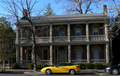
CLASH!by rayg544Comment by LucidLotus: It looks slightly tilted to me. I do like the contrast of flashy colorful car to old, stately colorless house. 5. |
| Photographer found comment helpful. |
| 03/30/2006 02:57:55 PM |
|
| Photographer found comment helpful. |
| 03/27/2006 08:58:53 AM |
The Crossingby rayg544Comment by Artifacts: Reminds me of the Buena Vista ferry crossing of the Willamette River south of Monmouth, Oregon USA. |
| Photographer found comment helpful. |
| 03/27/2006 12:49:12 AM |
The Crossingby rayg544Comment by hotpasta: the composition is uninteresting...it's really nothing more than a badly composed snapshot...sorry |
| 03/21/2006 12:40:35 PM |
Follow Meby rayg544Comment by BMacD: First Impression:
My eyes went to the face, to the hands, white part of left wing, down to the elbows, then over to the right wing. �What�s on the elbow?�
Composition:
Sky and wings too close in colour. Not enough contrast. May have been cropped to tight, but I don�t know what you may have been excluding on purpose. You didn�t include any notes on what you did taking the picture or post processing.
Subject:
Feel you met the challenge.
Technical:
Whites are blown and focus is soft. Nothing really sharp. Some contrast adjustment followed by some USM may have helped
Suggestions:
Don�t think the �sepia� effect works. May have been better in B/W, or original colour?
Summary:
Unfortunately, your statue doesn�t have a very high �interest� level. Post processing may not have been appropriate for this picture.
|
| Photographer found comment helpful. |
| 03/18/2006 04:25:40 PM |
|
| Photographer found comment helpful. |
| 03/18/2006 12:59:19 AM |
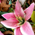
Fake Flowerby rayg544Comment by jmsetzler: Greetings from the Critique Club...
If you request a critique from the critique club, you should always fill out your 'Photographer's Comments' field when you submit your photo. When you don't include your own thoughts on the image, you can't really expect someone else to give their time and effort to give you a critique. It makes me think that you don't care enough about your own photo to take the time to post your thoughts on it...
This photo doesn't have much visual impact and the composition doesn't seem to have any particular consideration given to it at all. The background is quite busy and not complimentary of the subject either. The visual impact provided here is minimal and rather unimpressive. In my personal view, this photo is a very weak attempt... possibly a last minute idea. Better luck next time :)
John Setzler
|
| Photographer found comment helpful. |
| 03/16/2006 06:43:03 PM |
|
| Photographer found comment helpful. |
| 03/14/2006 11:40:16 AM |
|
| Photographer found comment helpful. |
Home -
Challenges -
Community -
League -
Photos -
Cameras -
Lenses -
Learn -
Help -
Terms of Use -
Privacy -
Top ^
DPChallenge, and website content and design, Copyright © 2001-2025 Challenging Technologies, LLC.
All digital photo copyrights belong to the photographers and may not be used without permission.
Current Server Time: 04/24/2025 12:52:55 AM EDT.