Universal Women Dictionaryby
cosmofireComment by LucidLotus: Hello from the Critique Club!
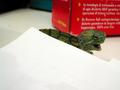
First, though a bit on the sexist side, I did see the humor in the photo. Beyond that however, I wasn't able to find much to draw me into the image. Let's dig a bit deeper:
First and foremost, the photo seems very straightforward. A photo of a book. As is, this has little impact on the viewer. You added humor to it with your slight adjustment (adding women) but didn't take it any further with other options available such as lighting, alternative focus, shadows, perspective, composition.
The colors are a bit dull but there is a nice contrast between the table wood and the mustardy color of the book. The composition is nice in its simplicity, but that also works against you because there are no other elements to keep the viewer engaged. The lighting is sufficient, but the focus while also adequate does call for a bit more sharpening. All in all, it is, in my opinion, a photograph that has average elements presented in an average way.
That said, I do think there is much that could be done with what you have. If you were inclined, I would recommend trying a couple suggestions.
First would be to add some dramatic lighting, perhaps a single shaft of light across the "English - Women, Women - English" part with the rest of the book in a bit of shadow, thus highlighting your main focal point. Perhaps have your light source shining behind something that will create an interesting pattern across the book face.
Second, perspective. This being a straight on shot, doesn't give it much flair - maybe taking it from a different angle, shifting the book itself, or something encompassing both of those lines could help add some punch.
I definitely do not want to discourage you, I think you took a solid photo in general, it just needs a little more atmosphere and a dash more creativity to give it a standout look.
Message edited by author 2003-11-25 22:58:54.