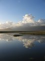
Automaticby
SkreppurComment by RiderGal: *Critique Club*
Hi... I hope my critique is helpful!!
First of all, I like what you were trying to go for here, however I feel the the reflection just didn't come out as strongly as it needed to for the challenge.
Compositionally I find it a bit lacking, there is just too much unneeded extra space, which I really don't see a point to having (unlike say where you purposely have blank space in an image) I feel you could have filled the space more appropriately... maybe even including the candles in your image? I find myself drawn to the very center of the image, and then I lose interest in it, it's not compelling me to explore the photo as a whole.
I like the focus on the word "automatic" but I'm trying to decide whether it could have been just a tad sharper or not (sorry I'm in college, and I've been doing a LOT of work).
I really like the colors that are in the image.
Overall I think you might have benefitted by taking a different look at different angles here, seeing this toaster from different ways, and trying different crops and compositions.