|
|
| Image |
Comment |
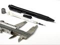
| 08/25/2002 06:24:00 PM | Mechanicalby jeremyaComment by stephan: Very nice idea! I like the simple composition and the lighting. Focus is good, too. I wonder how it would look in b&w because it does not have much colour and I think it would look better when completely desaturated. -stephan |
| 08/25/2002 04:49:00 PM | Mechanicalby jeremyaComment by johnmk: So what? Some of these pencils work this way. No excitement in this picture. |
| 08/22/2002 04:40:00 PM | |
| 08/21/2002 11:00:00 PM | Mechanicalby jeremyaComment by autool: Composition: Subject Placement, Cropping, Background3, Technical: Focus, Exposure, Lighting, Processing4, Challenge: Does your entry meet it?10, Appeal: Is it Interesting, Motivating, Etc.? 3, Total Averaged Rating5. Autool |
| 08/21/2002 12:59:00 PM | Mechanicalby jeremyaComment by jsabbarton: It's a pencil Jim, but no as we know it :o) It's a great shot; it has a clinically clean feel, it’s sharp, well composed and well lit. The only thing missing – a matter for debate since there is actually led in the picture, and technically, I suppose, a plastic pen with led in it could be construed as a pencil – is the pencil itself. I’m sure lots of others have, or will, point this outâ€Â¦ But, it’s still a great shot. (8) Hope that’s fair, personally, I think it IS a great shot, but I can’t see a proper pencil. |
| 08/21/2002 11:48:00 AM | Mechanicalby jeremyaComment by jmsetzler: very nice detail in this photo. I also like the diagonal view. Working on white backgrounds is not easy :) There is a very minor amount of image deterioration in the lower right corner that may be a result of level adjustments and uneven subject lighting. The caliper looks very good, but the pencil and it's elements seem a little oversharpened possibly. I'm not meaning to be picky here :) I am just pointing out some things that I see on a very well executed photo... = 9 - jmsetzler |
| 08/21/2002 10:18:00 AM | |
| 08/20/2002 05:36:00 PM | Mechanicalby jeremyaComment by Kavey: Nice and crisp, but don't like the way that the right is within the frame but the left bleeds out of it (can't think of the word I want, bleed isn't quite it really). Like the monotone colour scheme. Is it colour and then desaturated or are the items all black white and grey really? 5, Kavey |
| 08/20/2002 04:11:00 PM | Mechanicalby jeremyaComment by jimmsp: Composition - quite good Technical Aspects - quite good Meets Challenge - yes Visual Impact / Originality – high/good Other suggestions – I'd also like to see this with a background that is not so harsh Jim msp |
| 08/20/2002 03:31:00 PM | Mechanicalby jeremyaComment by decoteau: I may have liked this better with a colored background, but the concept is good and clarity is wonderful. |
Home -
Challenges -
Community -
League -
Photos -
Cameras -
Lenses -
Learn -
Help -
Terms of Use -
Privacy -
Top ^
DPChallenge, and website content and design, Copyright © 2001-2025 Challenging Technologies, LLC.
All digital photo copyrights belong to the photographers and may not be used without permission.
Current Server Time: 12/14/2025 02:13:46 AM EST.
|