DPChallenge: A Digital Photography Contest You are not logged in. (log in or register
 
Browse Settings
Currently viewing:
Registered Usertonyv

Show comments:

Per page:

Order:

Comments:


Comments Received by tonyv
Pages:   ... ... [91]
Showing 271 - 280 of ~909
Image Comment
Yellow Rose
05/31/2006 06:58:57 PM
Yellow Rose
by tonyv

Comment by amandalore:
very nice... maybe since this is advanced editing, you could have played around with getting rid of the back leaf and cropping the pic lower so as to not cut off the bottom leaf.... fantastic photo! 8
Photographer found comment helpful.
Yellow Rose
05/31/2006 04:38:25 PM
Yellow Rose
by tonyv

Comment by lifternessjt:
Nice, but would have loved to see more yellow come out. I like the texture on the leaves, they kind of look fuzzy.
Photographer found comment helpful.
Yellow Rose
05/31/2006 03:15:25 PM
Yellow Rose
by tonyv

Comment by KarenNfld:
Beautiful!
Photographer found comment helpful.
Southern Sun
05/31/2006 07:01:46 AM
Southern Sun
by tonyv

Comment by Dave Gordon:
The golden light on this building is lovely.
Photographer found comment helpful.
Kite into the Sun
05/30/2006 12:07:28 PM
Kite into the Sun
by tonyv

Comment by Jaded_Housewife:
i think the top half is absolutely perfect. i'd love to see a lot more contrast on the bottom and perhaps a soft glow/highlight around the man as he seems to blend in alot and I feel he should be more of a focal point, although contrast may be enough to fix that anyway. i think the angle is great, adds a lot of life to a shot that would be pretty boring if it had been shot straight on. nice work!
Photographer found comment helpful.
Boring
05/29/2006 05:10:09 AM
Boring
by tonyv

Comment by Artyste:
Greetings from the Critique Club. My critiques are generally geared towards trying to help you improve your score within DPC, and not on any true "artistic" merit of the photograph itself, unless it relates to DPC voters and scoring. Please keep that in mind as you read this.

Initial Thoughts
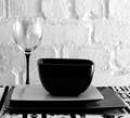
Nice arrangement, and B&W works for this shot, although I'm unsure about the wall.

Composition/Content
The assymetrical composition is something I'm not entirely sure of, personally. I'd like to see what happens to this shot with the plates and bowl lined up more centrally. From what I can picture, it'd ground the photo a little more. I also think it might have benefitted from a little more of a portrait orientation instead of square, but that's just me. As it stands, to my mind, it just doesn't feel right.

Background
As you stated, the lighting is harsh on the wall, and tends to take away from your subjects and arrangement. A softer mood would definitely have helped.

Camera Work/Technical
You did a pretty good job exposing for the light you did apparently have, with only the wall in the upper right really being the only bit slightly out of exposure. I'm glad you put in your comments that it was accidentally shot at 1600, or that would have really confused me. hehe. Nice work with the neat image though, I never would have been able to tell.

Digital Processing
As I said, good work on the neat image. Everything else looks really good as well, and the B&W conversion is quite nice, disregarding the over-exposure on the wall.

Fits the Challenge
A good fit for this challenge, as it contains all the elements necessary.

My Opinion of the Photo
As your title says, it really doesn't contain much of what DPC needs to score hugely high, but as you seem to have known this going in, I won't dwell on it. Some tweaking with your set-up though, and it could have had quite a bit more impact. Still, a 6 is never a bad score, so nicely done.
Photographer found comment helpful.
In the Heat of the Night ...
05/28/2006 03:12:55 AM
In the Heat of the Night ...
by tonyv

Comment by Bud:
A space heater? This would benefit from another object to help give it some frame of reference (feet in from of the heater or something else.)
Photographer found comment helpful.
It's the Eyes ... always the Eyes ...
05/24/2006 10:50:10 PM
Photographer found comment helpful.
It's the Eyes ... always the Eyes ...
05/24/2006 05:23:24 PM
It's the Eyes ... always the Eyes ...
by tonyv

Comment by coronamv:
Classic worn and weathered look. Photo has that sepia grade coloring. Gives me the feeling subject has something troubling him. Lighting is good. Image is crisp in the correct areas and fades out soft nicely.
Photographer found comment helpful.
Boring
05/24/2006 03:27:58 AM
Boring
by tonyv

Comment by wsteyn:
Congrats on the good placement Tony! Good composition and nice contrast in textures.
Photographer found comment helpful.
Pages:   ... ... [91]
Showing 271 - 280 of ~909


Home - Challenges - Community - League - Photos - Cameras - Lenses - Learn - Help - Terms of Use - Privacy - Top ^
DPChallenge, and website content and design, Copyright © 2001-2025 Challenging Technologies, LLC.
All digital photo copyrights belong to the photographers and may not be used without permission.
Current Server Time: 04/22/2025 12:30:20 PM EDT.