| Image |
Comment |
| 05/18/2006 08:45:49 AM |
Boringby tonyvComment by raish: This meets the challenge � it�s inanimate and arranged. You're not helping yourself with the title. Nice wall texture, nice composition. 7 |
 Photographer found comment helpful. Photographer found comment helpful. |
| 05/18/2006 06:13:53 AM |
DeVille Prison Cityby tonyvComment by amber: Hi from the Critique Club!
Two things immediately stand out in this image. The first is the contrast in colour between the subject and the background. The second is the man's expression.
I have no idea what the title refers too, but I presume it is a real prison, and that your subject is supposedly one of its guests. If that is the case, the background is perfect in that it looks like an old sepia image from a time gone by. And if you think about it, prisons are places that mess with the idea of time: Time inside drags for the inmates, but time outside stops for them. Often they come out to a world that they no longer recognise. So the sepia representing the archaic, time bending institution of prison is a perfect choice. The man on the other hand is in glorious technicolour, representing his individuality inspite of his being incarcerated.
The man's expression to me could suggest fear or menace - both of which are appropriate in this context, and it was well captured.
Your post processing steps in acheiving your overall image might as well have been written in Greek, as I am PS challenged, so I can only bow to your expertise and say well done;) |
| Photographer found comment helpful. |
| 05/17/2006 05:06:32 PM |
|
| Photographer found comment helpful. |
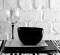
| 05/17/2006 02:50:00 PM |
Boringby tonyvComment by BeeCee: Should be titled "Simple Elegance" :) The many levels of contrast, in light, textures, shapes and materials, catch the eye immediately and hold the interest as we explore the details. My favourite so far. |
| Photographer found comment helpful. |
| 05/17/2006 02:15:59 PM |
|
| Photographer found comment helpful. |
| 05/17/2006 12:05:40 PM |
|
| Photographer found comment helpful. |
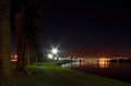
| 05/17/2006 10:39:46 AM |
Palm Beach IIby tonyvComment by SamDoe1: This one is probably the best of the series. The lines lead the viewer right through the photo. The only thing I can offer is that it's too dark. Maybe tweak it a little in Photoshop? |
| Photographer found comment helpful. |
| 05/17/2006 10:37:09 AM |
Victoria Wharfby tonyvComment by SamDoe1: I honestly don't think that you should have submitted this instead of the one you entered. I don't think this one is as interesting as the other one, and the crop on the top is kind of tight. Both are great shots, just that the other one (at least I think so) is better. |
| Photographer found comment helpful. |
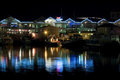
| 05/17/2006 10:05:25 AM |
Palm Beach IIby tonyvComment by Ken: This is a nice companion shot to the one you entered. In fact, I may even like it more. The lights curving around the lake are very effective and I want to walk down that path. The color of the grass is really well done. |
| Photographer found comment helpful. |
| 05/17/2006 08:39:27 AM |
|
| Photographer found comment helpful. |
Home -
Challenges -
Community -
League -
Photos -
Cameras -
Lenses -
Learn -
Help -
Terms of Use -
Privacy -
Top ^
DPChallenge, and website content and design, Copyright © 2001-2025 Challenging Technologies, LLC.
All digital photo copyrights belong to the photographers and may not be used without permission.
Current Server Time: 04/22/2025 03:19:48 PM EDT.