| Image |
Comment |
| 02/08/2005 08:08:42 AM |
|
| 02/06/2005 02:50:02 AM |
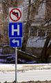
Don't Get Sickby missyanneComment by mdelaplane: Good sign story; good composition; I would have used a shallow depth of field to blur the background and draw more attention to the signs |
| 02/06/2005 12:35:41 AM |
|
| 02/05/2005 10:24:58 PM |
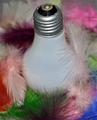
LIGHT as a Featherby missyanneComment by irika: ummmm...this picture looks too staged and although it goes along with the challenge subject, it is too streotypical. suggestion: get a clear bulb and stick the feathers in it. |
| 02/05/2005 09:04:05 AM |
|
| 02/03/2005 02:52:22 PM |
|
| 02/03/2005 10:24:21 AM |
LIGHT as a Featherby missyanneComment by charmayne: good idea with nice color. Just my opinion, but I might have composed this so that the unattractive metal bottom of the bulb were hidden in the feathers and if you could have found a way to illuminate the bulb for light instead of using an outside source (looks like you used an on camera flash) it might have been even better. |
| 02/03/2005 04:49:52 AM |
|
| 02/02/2005 10:51:35 PM |
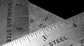
Rule of Threeby missyanneComment by TooCool: I'm torn between liking it this way, wanting more DOF or wanting less DOF. Your composition is excellent. Your choice of b/w treatment is impecible. You have great contrasts and tonality. It does look maybe a touch over sharpened. Maybe just me though. Nice job.
TC |
| 02/02/2005 08:29:37 PM |
|
Home -
Challenges -
Community -
League -
Photos -
Cameras -
Lenses -
Learn -
Help -
Terms of Use -
Privacy -
Top ^
DPChallenge, and website content and design, Copyright © 2001-2025 Challenging Technologies, LLC.
All digital photo copyrights belong to the photographers and may not be used without permission.
Current Server Time: 03/12/2025 03:26:15 PM EDT.