| Image |
Comment |
| 05/24/2005 10:02:43 PM |
|
 Photographer found comment helpful. Photographer found comment helpful. |
| 05/24/2005 06:56:38 AM |
|
| Photographer found comment helpful. |
| 05/22/2005 01:19:51 PM |
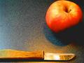
Let's Roll !by maessengerComment by Zed Pobre: Image is out of focus, seems slightly posterized, and has dark shadows that drop off too severely into black. The reflected highlight on the knife is also very harsh, and seems blown. The colors on the blade are somewhat pretty, but the colors on the handle are very odd, and the green at the left looks like fungus. Try a different angle to avoid the reflection, which is causing the extreme dynamic range hurting this image in both directions. If the title had been about the reflected light, drawing the interest to the colors, the image might have been more interesting, but as it is, it isn't really memorable, and the light just looks like an artifact of the reflection error. An apple and a knife on a counter alone isn't a very interesting image.
Base: 5
Technical: -2
Interest: -1
Emotion: +0
Bias: +0
Total: 2
|
| Photographer found comment helpful. |
| 05/20/2005 09:45:40 PM |
|
| Photographer found comment helpful. |
| 05/19/2005 03:26:21 PM |
|
| Photographer found comment helpful. |
| 05/18/2005 11:47:11 AM |
|
| Photographer found comment helpful. |
| 05/18/2005 12:52:39 AM |
Let's Roll !by maessengerComment by mpemberton: Neat idea, meet your maker style. There is to much glare in the photo, it has to effects. First, you can see complete square pixel boxes where the apple surface becomes black. Second, it is causing some-kind of funny overload in the image wreaking havoc on the colours and lines. 5 |
| Photographer found comment helpful. |
| 05/04/2005 04:48:29 AM |
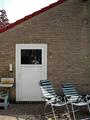
Zoom in on the windowby maessengerComment by messerschmitt: Gerry, not a brilliant score but a nice result anyway
the mainly nice comments should convince u to go on with this photography thing and surprise us some more with ur imagination
(but meanwhile don t u forget to work on that record dammit..bout time the 'world' should be aknowledged what a fine musician u are)
greetings
wil Message edited by author 2005-05-04 04:49:05. |
| 05/03/2005 07:43:24 PM |
Zoom in on the windowby maessengerComment by TooCool: Great concept, but you have a couple of minor flaws. Too many unneeded objects in the frame (lawn chairs and whatever is below the sink on the right. Also your subject needs much more light to make him the true focal point of the shot.
TC |
| 05/01/2005 05:57:59 PM |
|
Home -
Challenges -
Community -
League -
Photos -
Cameras -
Lenses -
Learn -
Help -
Terms of Use -
Privacy -
Top ^
DPChallenge, and website content and design, Copyright © 2001-2025 Challenging Technologies, LLC.
All digital photo copyrights belong to the photographers and may not be used without permission.
Current Server Time: 03/12/2025 06:40:23 PM EDT.