Out And About Againby
lshlesComment by graphicfunk: From the cririque club:
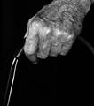
Now, here is a very interesting take on the subject of independence. You also took the liberty of presenting this image more as a study by the employment of b/w. So concept is a 9. It is the execution that created a little of letdown. Bear in mind, that I say little and this is verified by the 6.3 score. However, this could have finished much higher with just a little more attention.
Whenever you do a close up you must bear in mind that you are putting something right into the viewers face. This is good because they can not miss it. However, you must give them some rewards or some goodies that is above and beyond the concept. A single light source, even a regular house lamp would have made the hand texture really stand out and added that extra character. The walker is fine but it is deowned so suddenly that it leaves the viewer guessing what it is. At the end, I knew it was an aged hand on support. I thought it was cane but then it all sorted out and the image made complete sense.
Well, not many people will look at an image that long and some will simply dismiss it. Most people got it and that is good but imagine side lighting and to make it sing louder a wooden cane. Another area to explore is lide lighting with a tinge of backlighting.
The critique here is only in the final presentation which is about a 6 but the like I said the concept is a 9. The extra lighting step would have invariably given you a higher placing.
From a practical point of view we can say the image did well and the credit goes to your vision and clever concept and this at the end is a great asset to have because you will present other images which will rise above the commonplace. I did like the image and so did many others.