| Image |
Comment |
| 11/21/2005 04:08:25 PM |
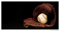
untitledby hollisterGqComment by hollisterGq: well the cap is a remake of the older versions used.. and I might try bringing them both into focus. thanks though |
| 11/21/2005 04:04:29 PM |
|
| 11/21/2005 03:06:39 PM |
|
 Photographer found comment helpful. Photographer found comment helpful. |
| 11/21/2005 03:05:22 PM |
untitledby hollisterGqComment by LeeD: I actually like the composition on this one, but feel the DOF is too shallow. I would like to see the cap in focus too. |
| Photographer found comment helpful. |
| 11/21/2005 02:57:17 PM |
untitledby hollisterGqComment by tonyv: The cap is a bit distracting. It doen't have the old world feel and colours of the mitt and ball ... i.e. it seems to be too modern. |
| Photographer found comment helpful. |
| 11/21/2005 02:56:20 PM |
|
| Photographer found comment helpful. |
| 11/20/2005 03:31:44 PM |
|
| 11/19/2005 10:19:15 PM |
|
| 11/17/2005 01:49:43 PM |
|
| Photographer found comment helpful. |
| 11/17/2005 07:08:51 AM |
|
| Photographer found comment helpful. |
Home -
Challenges -
Community -
League -
Photos -
Cameras -
Lenses -
Learn -
Help -
Terms of Use -
Privacy -
Top ^
DPChallenge, and website content and design, Copyright © 2001-2025 Challenging Technologies, LLC.
All digital photo copyrights belong to the photographers and may not be used without permission.
Current Server Time: 04/17/2025 07:41:18 AM EDT.