|
|
Comments Received by boone
| Image |
Comment |
| 05/11/2005 10:08:52 AM | Looking Beyondby booneComment by AlexMonty: This is cool, but it seems a bit blurry and a little small. Also, I would try and make it so that the two bottom lines both come from the corner, or are at least equidistant from the corner.
Good luck with this challenge, you have an intriguing entry. (6) |
| 05/11/2005 09:50:00 AM | |
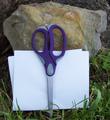
| 04/27/2005 03:57:43 PM | Rock,Paper,Scissorsby booneComment by sabphoto: boone, I'm having to go back and change my notes...I mentioned your colors were dull...I just found out by viewing the images on my work computer that my home computer (where I did the voting from) is lousy and will have to do some adjusting myself. That is going to hurt my challenge submissions too dang it. |
| 04/26/2005 03:32:18 PM | Rock,Paper,Scissorsby booneComment by sabphoto: I understand the desire to enter a challenge when it comes up but sometimes I feel people just enter anything just so they can say they entered. Your image feels like this.
Please consider the following as helpful as that is the intent of it. First your crop is too tight, leave some room for the eye to see and not feel so compacted to the small space. 2. Try and keep from centereing your image, use the rule of 3rds if at all possible (trust me I'm still fighting this tendancy to center stuff). When you move stuff to 1/3 of the image you will leave more image to see and becomes less boring. 3. Your image is a little dull in colors, see if you can add more light or adjust it in the computer. Remember to check the submission rules of editing first so you don't inadverntaly get DQ'd. and last...the scissors seem a little blurry, this could very well be from the compression of the image so your original may be good. I would love to see your uncropped one and see if there is something that could have been done to help this ordinary image become extrodinary. PM me if you have questons, I am by far not an expert but have learned a lot from here. |
| 04/26/2005 01:12:53 PM | |
| 04/26/2005 03:55:10 AM | |
| 04/22/2005 05:56:54 AM | |
| 04/21/2005 11:02:48 AM | |
| 04/21/2005 09:34:57 AM | |
| 04/20/2005 10:10:53 PM | Rock,Paper,Scissorsby booneComment by xonkas: Though you've included all three items in your shot, your composition lacks creativity and impact. The picture looks too soft and I find it to be too small, when you have the option to submit 640x640px sized pictures.
Maybe by adding contrast and sharpenning the image, it'll look better. |
Home -
Challenges -
Community -
League -
Photos -
Cameras -
Lenses -
Learn -
Help -
Terms of Use -
Privacy -
Top ^
DPChallenge, and website content and design, Copyright © 2001-2025 Challenging Technologies, LLC.
All digital photo copyrights belong to the photographers and may not be used without permission.
Current Server Time: 03/12/2025 08:13:48 AM EDT.
|