| Image |
Comment |
| 09/23/2005 07:08:31 AM |
|
| 09/22/2005 11:33:53 PM |
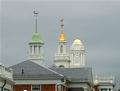
Architectural Photography - It's Fateby JunieMoonComment by sestevens: Architectural photography can be tough. One thing I would recommend is some sort of focal point or focii point....you've achieved that with the three different cupolas, but there's nothing really leading to it...I think it not allowing us to see the columns below, we're not able to appreciate the perspective at which this is taken at. I would suggest either seeing them, or cropping the photo further up near the bottom of the roof lines. |
| 09/21/2005 09:30:18 PM |
|
| 09/21/2005 08:17:19 PM |
|
| 09/21/2005 09:10:01 AM |
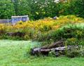
September Fairylandby JunieMoonComment by Jutilda: Too bad you couldn't use a glow filter on this one - with the title and all. I like the old shack - it certainly suits the challenge criteria, but it lacks a little oomph. The colors are pretty and complimentary. Hmmm - I think it's the logs in the forground like your eye can't decide if it should rest there or on the building. The focus is good and it is a definitely well thought out effort. |
| 09/21/2005 08:35:08 AM |
Architectural Photography - It's Fateby JunieMoonComment by Tammer: I wonder how this would look if you had the chance to shoot even closer to the weather vanes. For me, I think seeing the directionals on them woud have a greater destination impact. I like the concept. |
| 09/20/2005 05:37:50 PM |
Architectural Photography - It's Fateby JunieMoonComment by andri: It's oversharpened. Try, if you are using unsharp mask in Photoshop, to use less radius the next time, 0.2-0.5 is normally considered fine for web use.
It's also quite noisy - is this perhaps a heavy crop from a full-sized image?
As for the image itself, I don't really like it how one can glimpse the house below the roof - either you should have included more of the lower portions of the houses or skip that part entirely. You should also have moved slightly to the right so there would have been more space between the tower in the middle and the one to the right and it's quite distracting to the see that part of the building in the bottom left corner.
But quite frankly, I don't find this to be that interesting subject for photography. Couldn't you instead take a photo of the house we see a small portion of the bottom right corner? It seems to be a bit interesting. |
| 09/20/2005 07:46:46 AM |
|
| 09/18/2005 11:28:55 PM |
|
 Photographer found comment helpful. Photographer found comment helpful. |
| 09/18/2005 10:35:06 PM |
|
| Photographer found comment helpful. |
Home -
Challenges -
Community -
League -
Photos -
Cameras -
Lenses -
Learn -
Help -
Terms of Use -
Privacy -
Top ^
DPChallenge, and website content and design, Copyright © 2001-2025 Challenging Technologies, LLC.
All digital photo copyrights belong to the photographers and may not be used without permission.
Current Server Time: 04/08/2025 01:54:13 PM EDT.