| Image |
Comment |
| 04/11/2006 06:17:58 PM |
|
 Photographer found comment helpful. Photographer found comment helpful. |
| 04/11/2006 01:37:49 PM |
|
| Photographer found comment helpful. |
| 04/11/2006 11:57:34 AM |
|
| 04/11/2006 10:01:05 AM |
|
| Photographer found comment helpful. |
| 04/11/2006 10:00:30 AM |
|
| Photographer found comment helpful. |
| 04/06/2006 09:22:15 PM |
|
| Photographer found comment helpful. |
| 04/05/2006 11:02:56 PM |
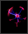
Mini Version of-In touch-by Bodby smilebig4me1xComment by Louis: Greetings from the Critique Club!
Your photo is a nice example both of a relatively low-key image, and an image in which negative space is used to good effect. One's eye is immediately drawn to the centre of the ball, and from there outward along the blue lines and to the edges. A nice composition.
In my opinion, though the negative space works well, it is possible that there is simply too much negative space. I think a tighter crop may have improved the overall composition. The bottom is particularly heavy; the effect there causes the ball to "float" in an unnatural way. Were the subject cropped at the edge of the frame, similar to the original, the image may have had a strong impact. For this reason, the rather heavy border also somewhat detracts, drawing the eye away from the main subject, which is much darker than the border. You may have also wanted to wait for a more interesting "pulse" from the orb, though the limitations of the hardware may be an obvious contributing factor.
Overall, a nice effort, and an interesting photo. Congrats!
Hope this helps,
Louis |
| Photographer found comment helpful. |
| 04/05/2006 07:53:18 AM |
Speed of Lightby smilebig4me1xComment by macrothing: I gave this a 6. Liked the colors against the darkness and the movement of the sparks/flames/fire. If these were all more vivid with more clarity (difficult), nudge rotate up on the left (maybe), variation in placement/composition and perhaps less empty space (especially to create a more 'macro' effect) likely have made this even better in my opinion. A more finely tuned crop on the left too. |
| Photographer found comment helpful. |
| 04/05/2006 07:51:14 AM |
|
| Photographer found comment helpful. |
| 04/03/2006 01:28:18 PM |
Dandilion Princessby smilebig4me1xComment by LucidLotus: Lovely portrait. The lighting for the most part is wonderful (there's that hotspot on the left shoulder that draws my eye) and the focus is good too. Nice color pop with the dandilion. The one thing I don't like about this is the background. The grass and green/browns just isn't doing it for me. I think its because the earthy tones are making her brown hair blend too much into the background. Still a nice portrait overall. 5 |
| Photographer found comment helpful. |
Home -
Challenges -
Community -
League -
Photos -
Cameras -
Lenses -
Learn -
Help -
Terms of Use -
Privacy -
Top ^
DPChallenge, and website content and design, Copyright © 2001-2025 Challenging Technologies, LLC.
All digital photo copyrights belong to the photographers and may not be used without permission.
Current Server Time: 04/24/2025 07:11:38 AM EDT.