| Image |
Comment |
| 11/04/2002 06:25:00 PM |
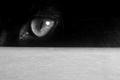
Don't cross my pathby zadoreComment by Azrifel: At last a GOOD pet photo. :-) This little devil looks like it is up to something, someone is definitely going be unlucky. Good shot. 8 |
 Photographer found comment helpful. Photographer found comment helpful. |
| 11/04/2002 03:40:00 PM |
|
| 11/04/2002 03:17:00 PM |
|
| Photographer found comment helpful. |
| 11/04/2002 12:03:00 PM |
|
| 11/04/2002 11:25:00 AM |
|
| 11/04/2002 09:49:00 AM |
|
| 11/04/2002 04:56:00 AM |
Don't cross my pathby zadoreComment by inspzil: This is a well taken photo. I'm not sure I like the composition. If the focus was just on the eye why use the foreground "cover" to hide the rest of the cat. It looks dark enough where if the background were dark, we wouldn't be able to see him anyway. The negative space in the shot would be accenting the eye much more than the distracting table or whatever it is. IMO - Inspzil |
| Photographer found comment helpful. |
| 11/25/2002 03:34:00 AM |
Pirateby zadoreComment by andrewm: The pirate�your subject is placed well�the three quarter position seems natural �the eye is drawn immediately to the figure. Then one follows the shadow and this is an interesting counterpoint to the figure. With a very plain background and a carpet as a base the photo is very simple and has little to distract the eye from the main subject You have used the rule of thirds to place your figure and this has added good compositional interest to the photo. The focus is good on my monitor and there is good detail on the figure. This challenge is a difficult one to balance the exposure and you have done this well�the figure is not overexposed on the bright side of the pirate �there is not much detail in the shadow but I think that the very dark shadows make the shot very interesting. In some ways the shadow seems to take over the image and there is a good tension between the subjects shadow and the subject itself. The texture of the carpet is brought out well with your lighting. I think your decision to go with black and white was correct because this is a photo that is almost an exercise in correctly using a single light source. I am sure there is not much of interest in the colours and the real subject is the interplay between light and shadow�in this way your photo meets the challenge directly. In my opinion you have produced a photo that well shows the impact of a simple composition and a one light source. As I mentioned before this is almost a classic exercise. And this is part of the problem �although the photo is good, it is a textbook illustration of the impact of a one light source and has little emotional appeal to the viewer. Although having said that -- there is humour and I think that this saves the photo from being boring. andrewm |
| 10/27/2002 05:01:00 PM |
|
| 10/26/2002 06:34:00 PM |
Pirateby zadoreComment by GinaRothfels: Nice shot, but if you'd turned the figure round the other way, we could have seen the face too. |
Home -
Challenges -
Community -
League -
Photos -
Cameras -
Lenses -
Learn -
Help -
Terms of Use -
Privacy -
Top ^
DPChallenge, and website content and design, Copyright © 2001-2025 Challenging Technologies, LLC.
All digital photo copyrights belong to the photographers and may not be used without permission.
Current Server Time: 04/18/2025 05:43:29 AM EDT.