| Image |
Comment |
| 06/01/2006 04:15:59 PM |
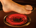
Hot Footin' Itby chaliceComment by kirsty_mcn: To be honest, while the concept is ok, the blur on the foot and the "painted on" nails really spoil this. Also, theres the matter of "why are you holding your foot over a stove?" Its not bizarre enough to be quirky, imho, just a bit strange. Having said all that, I was surprised it did not do better than this. |
 Photographer found comment helpful. Photographer found comment helpful. |
| 06/01/2006 03:33:49 PM |
Man in a Panama Hatby chaliceComment by kirsty_mcn: Looks like you got an awesome CC club comment, so I can't add much, but I'll add my $0.02 anyways
The lighting is very atmospheric, which works well with the posture, which I like, but does look a little awkward. The main thing that brings it down is the softness due to the long exposure. I don't personally mind the composition, because you're not looking out of the frame as such, you're just looking into the camera at an angle. |
| Photographer found comment helpful. |
| 06/01/2006 05:19:14 AM |
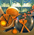
Asian Contemporary Still Lifeby chaliceComment by kirsty_mcn: Sorry to get to you so late,
I really like the arrangement of the still life, with the chopsticks echoing the shape of the wooden utensils, and the composition of the different circles together. I'm not sure about the flowers - they fit contextually, but the rest is very geometric and they don't seem to fit anywhere particularly.
I'm not sure about the window being there - it seems to contrast a little too much with the rest - its very cool in colour, compared with the warmer tones of the foreground, and I think this makes it look as though the wb is off overall.
Lighting is good, its lit well enough but still remains subtle.
I think this would have been better had you kept the same basic arrangement, but placed it somewhere without busy surroundings like the window, and either skipped the flowers or incorparted them into the composition more. |
| Photographer found comment helpful. |
| 06/01/2006 01:23:27 AM |
|
| Photographer found comment helpful. |
| 05/31/2006 11:38:12 PM |
Failure: Another Loser DPC Score!by chaliceComment by Melethia: Trading Post comment
Heh! This is pretty good! Only immediate improvement in "context" is to show the screen with the DPC page up - relies on title too much otherwise. Composition is not bad but the blinds in the background seem to draw my eye away from the subject. The baghead part is too darn funny - voters need to work on their sense of humor just a bit.
Edit to add - after reading Kelli's comments, yes, it would be nice to see an eye a bit clearer. |
| Photographer found comment helpful. |
| 05/31/2006 06:58:40 PM |
|
| Photographer found comment helpful. |
| 05/31/2006 04:23:04 PM |
|
| Photographer found comment helpful. |
| 05/31/2006 01:18:16 PM |
Hot Footin' Itby chaliceComment by Kelli: Trading post...
OK, first off most foot shots are judged bad, just because they're a foot! I think the concept fell flat because really, who would be walking across their stove? I didn't vote in this challenge but if I had I probably would have given this a 4. |
| Photographer found comment helpful. |
| 05/31/2006 01:16:00 PM |
Failure: Another Loser DPC Score!by chaliceComment by Kelli: Trading post...
This is funny! Too many grouchy people that don't have a sense of humor on this site, IMHO. The right arm (on the left) is a little bright. I can just barely see one eye, I think an improvement would have been to see at least all of one eye and maybe some of the other. Other than that, great job! |
| Photographer found comment helpful. |
| 05/31/2006 11:42:15 AM |
|
| Photographer found comment helpful. |
Home -
Challenges -
Community -
League -
Photos -
Cameras -
Lenses -
Learn -
Help -
Terms of Use -
Privacy -
Top ^
DPChallenge, and website content and design, Copyright © 2001-2025 Challenging Technologies, LLC.
All digital photo copyrights belong to the photographers and may not be used without permission.
Current Server Time: 04/22/2025 09:54:10 PM EDT.