| Image |
Comment |
| 09/03/2006 09:18:04 PM |
|
 Photographer found comment helpful. Photographer found comment helpful. |
| 09/03/2006 07:36:09 AM |
|
| Photographer found comment helpful. |
| 09/02/2006 11:11:20 AM |
|
| 09/01/2006 02:08:00 PM |
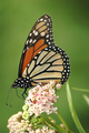
Monarchby bryantbusComment by twm122: I like this but maybe bump up your saturation a bit to give it more of a pop. |
| Photographer found comment helpful. |
| 09/01/2006 11:37:04 AM |
|
| Photographer found comment helpful. |
| 08/29/2006 11:56:05 AM |
|
| Photographer found comment helpful. |
| 08/29/2006 11:04:41 AM |
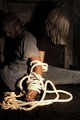
Bound to Each Otherby bryantbusComment by Borusa: Nice light. They don't seem to be that tightly bound! Looks very escapable. I like the two-toned, limited palette look you've achieved here. |
| Photographer found comment helpful. |
| 08/29/2006 10:50:24 AM |
tom3.jpgby bryantbusComment by Jutilda: EXCELLENT! Love the overlay and the post editing technique. Man, he looks like he'd really kick some butt. |
| Photographer found comment helpful. |
| 08/27/2006 09:21:08 AM |
Bound to Each Otherby bryantbusComment by MichaelC: IMO the binding illustrated here does not go with the theme ie: too loose.the rope 'pops' which is good but the rest of the image appears too flat - 6 |
| Photographer found comment helpful. |
| 08/26/2006 10:01:41 AM |
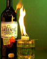
Burning the green fairyby bryantbusComment by MattO: Greetings from the critique club. After viewing your photo I have a few things to mention. First the choice of subject and back ground combination work very well. Its a well thought out composition and setup. I wish it wasnt so tightly cropped on the left with so much negative space on the right. I would have liked to have seen the top of the bottle as well. The only other thing is the flash reflection on the bottle. Overall very well done, I would have scored this a 6 on initial look and depending on the rest I may have bumped it to a 7 later on. Nicely done and good luck with future challenges. |
| Photographer found comment helpful. |
Home -
Challenges -
Community -
League -
Photos -
Cameras -
Lenses -
Learn -
Help -
Terms of Use -
Privacy -
Top ^
DPChallenge, and website content and design, Copyright © 2001-2025 Challenging Technologies, LLC.
All digital photo copyrights belong to the photographers and may not be used without permission.
Current Server Time: 04/08/2025 01:53:53 PM EDT.