| Image |
Comment |
| 10/27/2005 01:44:22 PM |
|
 Photographer found comment helpful. Photographer found comment helpful. |
| 10/27/2005 07:00:56 AM |
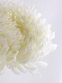
oneby bryantbusComment by macrothing: 8 - Very nice. Whilst no expert on 'highlight control' re the Challenge, seems to me you have done an excellent job to not 'blow' any surface. Criticism; not much at all, perhaps a different crop, to not cut off the top part of the flower, not sure, as I do like this angle, especially to show the detail in the petals/color for the Challenge. Maybe a little more space on the right, again not sure. edit:typo Message edited by author 2005-11-02 00:16:41. |
| Photographer found comment helpful. |
| 10/27/2005 12:40:23 AM |
oneby bryantbusComment by AzCKelly: Wow, what a great picture. Really love the softness about it and all the petals and lines are fantastic. Good Job! |
| Photographer found comment helpful. |
| 09/21/2005 10:03:52 AM |
CLby bryantbusComment by okiesisi: Greetings from the Critique Club!!
I really do like this portrait. The Subject is nicely composed, the background is well suited, and the lighting on his face is very nice. The white shirt and hat really allow his face to be the primary focus. As the comments mentioned, there is a "hot spot" on his right shoulder. Sometimes this can be fixed using dodge and burn. One thing that might have made him stand out even more would be to sharpen him and make the background less sharp. Overall, a very nice portrait, extremely well done.
~SiSi |
| Photographer found comment helpful. |
| 09/16/2005 04:00:36 PM |
|
| 09/14/2005 07:53:52 PM |
|
| Photographer found comment helpful. |
| 09/14/2005 07:23:25 PM |
|
| Photographer found comment helpful. |
| 09/14/2005 12:18:11 PM |
CLby bryantbusComment by docurrie: I like this a lot, good clean lines. Good masculine pose. It should do very well. |
| Photographer found comment helpful. |
| 09/14/2005 02:17:00 AM |
CLby bryantbusComment by pixieland: The background takes so much away from what is otherwise a really nice portrait. Too many distracting elements taking my eyes away from the model. Lighting and exposure are well done. |
| Photographer found comment helpful. |
| 09/13/2005 07:51:08 PM |
CLby bryantbusComment by JEFFJSB: the cutout in the fence is very distracting. If the fence was all there it would make a world of a difference |
| Photographer found comment helpful. |
Home -
Challenges -
Community -
League -
Photos -
Cameras -
Lenses -
Learn -
Help -
Terms of Use -
Privacy -
Top ^
DPChallenge, and website content and design, Copyright © 2001-2025 Challenging Technologies, LLC.
All digital photo copyrights belong to the photographers and may not be used without permission.
Current Server Time: 04/23/2025 08:13:16 AM EDT.