| Image |
Comment |
| 07/12/2005 11:35:03 PM |
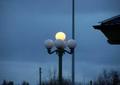
Lightsby ofurpesiComment by Jeileen: The composition of this is off. The intrusion by what is probably a roof is very distracting. But so is the pole that is growing through your light globe. The size also hurts this photo. Most photo editing software has a way to resize the photo to submission size according to the rules. Keep shooting! |
| 07/11/2005 04:57:47 PM |
|
| 07/09/2005 03:48:02 PM |
Lightsby ofurpesiComment by beaflies: //www.dpchallenge.com/tutorial.php?TUTORIAL_ID=26
Unfortunatly your shot is much too small to see any detail. Try this tutorial. If you don't have photoshop, most programs that come with a digital camera include these functions with a different name. Hope that helps. |
| 07/09/2005 07:56:40 AM |
Lightsby ofurpesiComment by tmorninglory96: This one is way too small. It really needs to be bigger to see the details of the lamp. Also a different angle taking the picture would have eliminated the dark line running though the picture, a telephone pole maybe? |
| 07/08/2005 04:15:12 PM |
|
| 07/08/2005 12:11:51 AM |
Lightsby ofurpesiComment by aboutimage: Too small, but the concept is nice. 6 for mood and composition, -1 for the size (it's truly too small to appreciate fully). 5 |
| 07/08/2005 12:07:35 AM |
|
| 07/07/2005 11:44:31 PM |
|
| 07/07/2005 03:57:59 PM |
Lightsby ofurpesiComment by ccraft: You've probably already heard this is a bit small for DPchallenge. People with larger images tend to get higher votes. however, I'd like to comment on the overall image, since most people don't do that. I really like your approach and you left the shutter open the perfect amount to illuminate the single light. i'd suggest trying to visualize the finished product even as you're taking the shot. The blues are perfect, but I'd suggest trying to see some ofthe distracting elements like the pole behind and the roof. I'm not sure what a different angle would have produced, but maybe looking closer at teh light, or zooming into the light would have helped - and maybe taking it from a different angle would have removed the distracting elements. Also, while many centred shots work very well for effect, using the rule of thirds (where your element is on one/third of the image, usually has a higher impact visually. There are a lot of great articles about the rule of thirds online if you'd like. Good luck with this. i suspect it won't do as well as it deserves given its size, but hopefully we'll see more of your work in teh future. |
| 07/07/2005 10:59:29 AM |
Lightsby ofurpesiComment by DeniseBernadette: I know you're probably getting tons of comments about the size of your picture, so I won't mention that. ;) I think the shot has potential.. but the surrounding objects are distracting, like the pole in the background and the roof (?) on the right side. I think closer shot taken from beneath or at a different angle would have been more interesting. |
Home -
Challenges -
Community -
League -
Photos -
Cameras -
Lenses -
Learn -
Help -
Terms of Use -
Privacy -
Top ^
DPChallenge, and website content and design, Copyright © 2001-2025 Challenging Technologies, LLC.
All digital photo copyrights belong to the photographers and may not be used without permission.
Current Server Time: 03/13/2025 12:44:40 AM EDT.