| Image |
Comment |
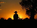
| 02/01/2006 01:33:28 PM |
my son at the light of dayby moore8Comment by gerdagrice: I love the colours and the silhouettes. However, I would clone out the distracting bit of tree silhouette at the top left. Also, I think this composition would have been even stronger if your son weren't quite so central in the frame. Give the position of the tree at the right +, it seems, another tree just beyond the edge of your frame at the left, though, that might welll have been just about impossible to do. I love the hat! |
 Photographer found comment helpful. Photographer found comment helpful. |
| 10/16/2005 09:29:34 AM |
A child is worthliving for.by moore8Comment by AzCKelly: Aww, he's pretty happy there. Great shot. I would get rid of most of the back wall, its distracting to see the knobs and the color doesn't complement your subject well. Try to zoom in and catch that face more, Hes a cutie! |
| 10/16/2005 06:45:15 AM |
|
| 10/15/2005 10:06:55 PM |
|
| 10/14/2005 06:16:58 PM |
A child is worthliving for.by moore8Comment by Falc: OK - pets, kids and toys, unless they are especially good then they tend to look like snaps. This has very obious 'snap' giveaways - the dark shadow from onboard flash, the taps half in frame and half out of frame, the sloping and very plain background.
Now, for an example of how good kid photos can be go and check out some of Jacko's images. He used directional light either from an off camera flash or from a natural light source (window). He makes sure that the background and setting do not distract from the baby. Well worth studying some of these techniques. |
| Photographer found comment helpful. |
| 10/14/2005 09:07:33 AM |
A child is worthliving for.by moore8Comment by cmeier: a cute child with a winning smile, but the lighting/cropping of this shot doesn't really suit me. perhaps a closer cropped might have helped... |
| 10/12/2005 10:45:14 PM |
|
| 10/11/2005 05:38:56 PM |
A child is worthliving for.by moore8Comment by tpoc: pretty effects of light in the water. cute child. strategic placement of the rubber duckie. would like to see this image with some light bounced from the other direction to add some depth and knock down that distracting shadow...plus a little bit of cropping on the right. adorable expression! |
| 10/11/2005 03:27:52 PM |
|
| 10/11/2005 02:43:13 PM |
|
Home -
Challenges -
Community -
League -
Photos -
Cameras -
Lenses -
Learn -
Help -
Terms of Use -
Privacy -
Top ^
DPChallenge, and website content and design, Copyright © 2001-2025 Challenging Technologies, LLC.
All digital photo copyrights belong to the photographers and may not be used without permission.
Current Server Time: 03/12/2025 10:10:55 AM EDT.