| Image |
Comment |
| 10/12/2005 10:54:19 PM |
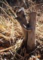
The Embraceby lenahComment by noseprints: this is one of my favourites. too bad the light is kind of harsh. really evocative, otherwise. great find. |
 Photographer found comment helpful. Photographer found comment helpful. |
| 10/12/2005 02:00:31 PM |
|
| Photographer found comment helpful. |
| 10/12/2005 10:15:53 AM |
The Embraceby lenahComment by Jutilda: HEE HEE. The light is a tad brash, but I like the idea and it certainly suites the challenge. Black and white might work here. |
| Photographer found comment helpful. |
| 09/04/2005 02:32:11 PM |
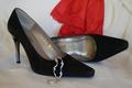
Sexyby lenahComment by Tartarus: This would be a great advertisement shot. The red in the background helps the picture quite a bit. However I am not sure about the jewelry in the near shoe. I can understand the desire to break up the long expanse of black in the front, but I think the jewelry might be too detailed, maybe a simple chain would have been better? |
| Photographer found comment helpful. |
| 09/02/2005 10:47:32 PM |
Sexyby lenahComment by Beetle: I like this composition, your attention to detail, the splash of red, the jewelllery...... It all looks very "stock photo", but very nicely done, indeed! 8 |
| Photographer found comment helpful. |
| 09/02/2005 06:06:58 AM |
Sexyby lenahComment by KiwiShotz: Red, black, silver and white ... always a great combination |
| Photographer found comment helpful. |
| 09/01/2005 09:07:20 AM |
Sexyby lenahComment by PoetryInColor: Very nice. I like the splash of color, and soft textured background. Bracelet was a nice addition. |
| Photographer found comment helpful. |
| 08/16/2005 05:53:04 PM |
|
| Photographer found comment helpful. |
| 08/14/2005 06:39:18 AM |
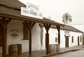
1920'sby lenahComment by macrothing: 5 - Met the Challenge with the 'feel' of the era (a shot of this in a time capsule would depict it for future generations). I just wish you had left it at '1920' (be a 7 if you did from me). Criticism; I like the angle, but would like it even 'sharper', get more of a depth of field, depending of course what is there 'right of screen'. Whilst this shot is fairly 'clean', given the Challenge and trying to capture the 'feel' of the era, I would like to have seen a few more 'era' specific items - a horse would be great or a man leaning on the post smoking a cigar or pipe (where are they when you need them). Good shot and 'depiction'. The building/billboard at the end of the building on the right is a touch distracting but minor. The color is good, maybe just a tad more contrast/drama, may have made this a better photograph in my opinion. edit: typos Message edited by author 2005-08-17 05:13:25. |
| Photographer found comment helpful. |
| 08/10/2005 02:42:31 PM |
|
| Photographer found comment helpful. |
Home -
Challenges -
Community -
League -
Photos -
Cameras -
Lenses -
Learn -
Help -
Terms of Use -
Privacy -
Top ^
DPChallenge, and website content and design, Copyright © 2001-2025 Challenging Technologies, LLC.
All digital photo copyrights belong to the photographers and may not be used without permission.
Current Server Time: 03/13/2025 12:53:01 AM EDT.