| Image |
Comment |
| 09/18/2005 08:50:09 PM |
|
| 09/18/2005 01:40:23 PM |
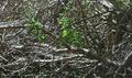
just a littleby larscComment by idnic: Greetings from the Critique Club.
I agree with some of the comments made below regarding the general lack of interesting composition in this shot. While it definitely does meet the challenge guidelines, it does not seem to have any real point of interest making it difficult for they eye to settle. There definitely ARE areas in focus here, but an increased depth of field would have helped somewhat.
For better impact you might chose a particularly interesting section or small area instead of trying to capture the entire bramble at once; leaving you with a more simplified composition. If you use Photoshop or similar program, a slight increase in contrast will also give you added ooomph.
Lighting and color look good, well handled.
I hope this helps. |
 Photographer found comment helpful. Photographer found comment helpful. |
| 09/15/2005 08:09:01 PM |
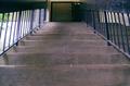
a long way upby larscComment by kena: Nothing really seems to be in focus, and I don't really care much for this picture but there's nice perspective. |
| Photographer found comment helpful. |
| 09/15/2005 02:51:58 PM |
a long way upby larscComment by madison461: This is a great perspective shot. The only thing I think could improve it would have been to move a bit to the left so that the bright lighting to the left wasn't showing. Nice work! |
| Photographer found comment helpful. |
| 09/15/2005 01:47:14 PM |
a long way upby larscComment by persimon: I think this is how small children and animals see stairs!! I like the perspective. A brightly colored object at the top of the stairs or on one of the upper steps would have been a nice touch. |
| Photographer found comment helpful. |
| 09/14/2005 08:58:43 PM |
just a littleby larscComment by Titia: You may have gotten low points, but reading the comments I think most of them didn't get your point at all.
They all shout 'no focus' but if they had taken the time to look, they would've seen that tiny spot of sunlight in the middle, that's where my eye is drawn to.
And even the humor of your title they didn't get, did they.
It could have been just a bit sharper, but I think that little unsharpness might be due to resizing. If so, you should sharpen a little bit after resizing.But it doesn't bother me at all.
I think it's a great photo and more than others I've seen in the higher regions, this is exactly what the topic is about: branches.
I don't submit and vote anymore in the challenges, but I would've given you an 8.
Titia |
| Photographer found comment helpful. |
| 09/13/2005 01:06:38 PM |
|
| 09/12/2005 07:46:17 PM |
|
| Photographer found comment helpful. |
| 09/10/2005 07:44:51 PM |
|
| Photographer found comment helpful. |
| 09/10/2005 01:24:24 AM |
just a littleby larscComment by bowronfam3: A little what? Just looks like a mess of tree branches to me. This photo looks like no thought was put into it. |
| Photographer found comment helpful. |
Home -
Challenges -
Community -
League -
Photos -
Cameras -
Lenses -
Learn -
Help -
Terms of Use -
Privacy -
Top ^
DPChallenge, and website content and design, Copyright © 2001-2025 Challenging Technologies, LLC.
All digital photo copyrights belong to the photographers and may not be used without permission.
Current Server Time: 04/26/2025 12:06:57 PM EDT.