| Image |
Comment |
| 10/10/2005 07:41:55 PM |
Bloomingby shadeeuaComment by ericpi: Looks like it is a nice shot, but a bigger image would have been helpful. |
| 10/10/2005 09:15:24 AM |
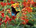
Bloomingby shadeeuaComment by HVGB_photos: Too many complementary pairs here to demonstrate the effect of one colour contrasted against its opposite. If you could have shot the blue butterfly against the yellow flower and then cropped tightly to eliminate any red or green, or else if you had shot just the red and green flowers, you would have had a better demonstration of complementary colour contrast. |
| 10/09/2005 06:18:47 PM |
|
| 10/08/2005 10:15:37 PM |
Bloomingby shadeeuaComment by mkalandros: Why such a small image? It looks like there are some really nice details, but I can't really make them out because of the size. |
| 10/08/2005 08:15:58 PM |
|
| 10/07/2005 04:05:24 PM |
Bloomingby shadeeuaComment by luv2photo: I wish the image were larger to get a better look at the details. Nice capture with the butterfly though. |
| 10/07/2005 11:22:12 AM |
|
| 10/07/2005 06:17:20 AM |
|
| 10/06/2005 10:09:06 PM |
Bloomingby shadeeuaComment by MPRPRO: TOOOOOOOO Small why do people do this? 640x480 works great useing "save for the web" in Photoshop. My screen is 1280x960 you how small this image is on my screen? I didn't even see the butterfly till now. Bigger is better just not bigger then 640. |
| 10/06/2005 08:40:50 PM |
Bloomingby shadeeuaComment by trishialw: A bigger photo would be good. It looks like a great shot, but it is difficult to see the details. |
Home -
Challenges -
Community -
League -
Photos -
Cameras -
Lenses -
Learn -
Help -
Terms of Use -
Privacy -
Top ^
DPChallenge, and website content and design, Copyright © 2001-2025 Challenging Technologies, LLC.
All digital photo copyrights belong to the photographers and may not be used without permission.
Current Server Time: 04/13/2025 06:08:33 PM EDT.