| Image |
Comment |
| 02/15/2006 12:57:59 PM |
Broken lettersby lunixComment by zeuszen: well, perhaps no 8, 9 or 10, but 4.2? I found this an exciting asymmetry and, as IreneM (below) has already said, a composition worth pondering. |
| 02/15/2006 07:08:29 AM |
The force of the architectureby lunixComment by davmct: nice use of leading lines. i dont think the black & white helps though, there are way too many mid-tones of gray, and the sky seems to just wash out. perhaps if this was an advanced challenge, you cuold have darkened the sky a bit mroe to make it seem more ominious |
| 02/08/2006 06:48:52 AM |
Broken lettersby lunixComment by IreneM: This only worked for me after looking at it for a bit longer. At first glance I wasn't too impressed - but it's very cleverly composed. |
| 02/08/2006 04:25:54 AM |
|
| 02/02/2006 12:30:25 PM |
|
| 11/22/2005 03:33:05 PM |
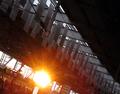
Stationby lunixComment by industreality: not sure what i'm looking at. the glare is the obvious center of the image, but it takes away too much from what it is hiding. (the people?, if so they are out of focus.) |
| 11/22/2005 04:58:45 AM |
|
| 11/21/2005 05:51:19 PM |
Stationby lunixComment by tannah: I dont see the interest in this picture, too blurry, a burned sun spot... |
| 11/21/2005 07:11:57 AM |
|
| 11/19/2005 12:48:57 PM |
|
Home -
Challenges -
Community -
League -
Photos -
Cameras -
Lenses -
Learn -
Help -
Terms of Use -
Privacy -
Top ^
DPChallenge, and website content and design, Copyright © 2001-2025 Challenging Technologies, LLC.
All digital photo copyrights belong to the photographers and may not be used without permission.
Current Server Time: 03/14/2025 10:04:05 AM EDT.