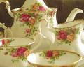
DPChallenge: A Digital Photography Contest You are not logged in. (log in or register
 
Browse Settings
Currently viewing:
Registered Userracw

Show comments:

Per page:

Order:

Comments:


Comments Received by racw
Pages:  
Showing 81 - 90 of ~99
Image Comment
Walls Have Eyes...
11/17/2005 01:35:19 PM
Walls Have Eyes...
by racw

Comment by cheegirl:
I like your subject and camouflage but the plant is distracting and its a bit out of focus.
Photographer found comment helpful.
Walls Have Eyes...
11/16/2005 04:04:57 PM
Walls Have Eyes...
by racw

Comment by Neuferland:
Yes they do! Great shot, nice capture overall. As I'm sure you've heard or are going to hear, focus. Nothing is in sharp focus and a soft focus doesn't really work well with this shot for my personal taste. I'm guessing it was a quick shot before the little guy took off and they are fast, this I know having had to catch them when working at a pet store.

He blends in very well with the wall itself an dif you could have captured him just on the wall that would have been great because the leaves are a bit distracting, especially the one in the front that is so bright. But getting it just as he's looking at the camera, WTG! :) A 6
Photographer found comment helpful.
Walls Have Eyes...
11/16/2005 02:33:35 PM
Walls Have Eyes...
by racw

Comment by chet:
Too grainy and out of focus (the leaves).
Walls Have Eyes...
11/16/2005 12:10:25 PM
Walls Have Eyes...
by racw

Comment by katswig:
Out of focus.
Walls Have Eyes...
11/16/2005 02:06:56 AM
Walls Have Eyes...
by racw

Comment by Jammur:
Good idea. I think a tighter cropping might have helped.
Photographer found comment helpful.
Walls Have Eyes...
11/16/2005 01:04:12 AM
Walls Have Eyes...
by racw

Comment by kenskid:
A little blurry.
Looking Out Over the World...
11/15/2005 04:34:52 PM
Looking Out Over the World...
by racw

Comment by Spicelynn:
My idea of landscape is not looking at tops of buildings. But then that is only my opinion which doesn't count for much.
Looking Out Over the World...
11/09/2005 05:53:09 PM
Looking Out Over the World...
by racw

Comment by MQuinn:
I like the framing of the 2 pillers, I like the vast sea of green. I wish this was less of an angle shot and more straight on. Its also a little busy with all the buildings.
Photographer found comment helpful.
Looking Out Over the World...
11/09/2005 05:50:55 PM
Looking Out Over the World...
by racw

Comment by Tammer:
I like the landscape itself. For me, I would have scored it higher if the column on the right had been completely cropped out.
Photographer found comment helpful.
Porcelain Sea
11/08/2005 06:00:10 PM
Porcelain Sea
by racw

Comment by CEJ:
Hello from the Critique Club!

I have studied your image and have the following to offer:

Composition/perspective - the shot is very busy with all four pieces in the frame. The camera seems a bit close and the DoF seems off a bit. Focus isn't clear until you reach the inside of the cup on the left. Every piece is cut off somewhere, positioning farther back from the subject would have helped both the focus/DoF as well as removing some of the distraction created by the front cup being out of focus. Would have been stronger with only one or perhaps the two middle pices only in the shot with a different angle to the subjects.

Color - the colors, although a nice palette, seem a little flat. Perhaps this is caused by it being china, not sure. A boost in contrast and adjustment to the white balance may have helped this. There is a slight tint to the whole scene that just doesn't fit. None of the china appears white until you reach the very back where the light and focus seem to be the strongest.

Lighting - in some areas the lighting seems too bright - you have flares and washed out areas o the inside of the front cup, the rim and inside of the left cup in the middle, the whole side of the right cup, the top and side of the pitcher as well as in your black background. Trying a different light that is not so hard or using something as a diffuser may have helped this.

Challenge requirements - yes, china is delicate, but your placement and number of objects in this image do not convey that as well as a single cup may have. What makes china delicate is not only the material, but the subtle curves and bends that are associated with it. You don't show any of those here except in the handles and those are either cut off or interrupted by something else.

Overall/my opinion - this could have been a much stronger shot with less going on - fewer objects, a little more attention to the lighting and the post processing. Try using a non reflective background as well. You have glare on the black that just doesn't fit and becomes a distraction.
Photographer found comment helpful.
Pages:  
Showing 81 - 90 of ~99


Home - Challenges - Community - League - Photos - Cameras - Lenses - Learn - Help - Terms of Use - Privacy - Top ^
DPChallenge, and website content and design, Copyright © 2001-2025 Challenging Technologies, LLC.
All digital photo copyrights belong to the photographers and may not be used without permission.
Current Server Time: 03/12/2025 09:38:18 AM EDT.