A small fortuneby
olbolComment by macrothing:  Critique Club Critique
First Impressions
Critique Club Critique
First Impressions
I like the subtle colors.
Photograph Information, Technicals & Composition Review
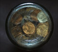
Just read your Photographer's Comments: cannot help with the marks on the glass, they look like they are hand engraved, maybe a M5 4 at the top with a line underneath and then 1 6 1 V V 0 E (?) - no idea really.
Beside the flash reflection at the top of the glass, the technicals all seem to have produced a decent quality image. I like the background, however (and not to contradict what I said about the colors), the overall image is a little uninteresting. Perhaps if the letters were more discernible, not sure - what I see when I view this image is primarily the end of a bottle / jar of coins. It could possibly work as an abstract, but again, either some elements in sharper focus to add interest, otherwise perhaps a variation in angle. The centered composition is also a little static.
Difficult Challenge to shoot for - simply finding something that is 'round' or a 'circle', doesn't necessarily mean it will be interesting to view in an image. I'm not suggesting that this 'circle' doesn't have potential, I think it may - but no matter how creative you were photographing it, I'm just not sure how much engagement it would achieve.
The only real composition comment I'll make is that the colors of the coins within the bottle are not 'balanced'.
Comments, Score & Placement Review
82/149 is not bad placing - and your score is over 5 at 5.06. You may be semi pleased with this. You mention low scoring recent entries, and I just took a look at your recent scores - ok, so this is probably falling into an average.
Everyone comes to DPC for different reasons and those that do enter an image in a Challenge don't always aspire to score high - again, there is individual reasoning. If you want to score higher, you have to produce an image that engages the viewer in some way. However the catch is that what engages one viewer will not engage another. Go for mass appeal, and you'll likely score high. Of course, just submitting something that appeals
strongly to you is an individual road to be on and if a majority like it too - then there is a little more substance to the gratification, in my opinion. Depends what you're seeking.
Your 5 commenters all tried to relay something that they liked within the image - which is always helpful to learn what is appealing to your viewers/voters.
Summary
Possibly better potential with some further tweaking in pp to bring about a little more depth and pop. Otherwise, 'next time' trying to select something with added interest, including the elements, would likely produce a stronger image.
edit: wording & typoMessage edited by author 2009-08-12 15:11:55.