| Image |
Comment |
| 01/09/2008 06:58:30 PM |
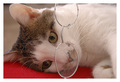
Furry Scholarby sarrobiComment by alohacarrot: The cat is very cute! You didn't really focus on the glasses enough. Maybe you could have put the glasses on the cat. |
 Photographer found comment helpful. Photographer found comment helpful. |
| 09/23/2007 08:11:25 AM |
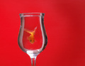
Goldfish Revisitedby sarrobiComment by Judi: I like the lighting over the fish in this version...but the blown out area at the base of the glass is distracting. |
| Photographer found comment helpful. |
| 09/22/2007 06:45:13 PM |
Goldfish Revisitedby sarrobiComment by see: Better than the original in clarity, but I�m comparing to the original and the lighting is quite different, I rate this a 8 for that reason. |
| Photographer found comment helpful. |
| 09/20/2007 08:13:15 PM |
|
| Photographer found comment helpful. |
| 09/20/2007 05:22:56 PM |
Goldfish Revisitedby sarrobiComment by LN13: Honestly...Ilike yours better. teh original is just too red for me. I likehow you have offset the red withthe glass. I like the greater deatin in the fish as well. |
| Photographer found comment helpful. |
| 09/19/2007 07:57:13 PM |
Goldfish Revisitedby sarrobiComment by CNovack: The bold and vibrant red background really pops out at you in this composition. I really like how you caught the goldfish in a position that it is looking at us - probably a task that took much patience while it swam around freely in the glass. A good attempt in trying to emulate the original. However, there are several things you could do to improve the visual impact of this photo in order to move it out of the above average category and into the stellar category. First, the reflections on the glass are a real distraction especially since it takes away from what could be just clean lines of the glass and the main subject which is the goldfish. A good polarizer will help minimize or remove those reflections for you. Second, while bold, the background appears flat. The original has a variation in the tones of the reds (a fade from deep red to a lighter red) which gives it added dimension and thus more visual pop...mayhap adjusting the light source so that the top is not as brightly illuminated as the center would help. Certainly the polarizer will serve to darken the image abit as well. Third, The goldfish is not in as sharp a focus as it could be. Not quite sure as to how you could effectively capture sharpness as that I have never tried shooting something in a glass which I am sure adds a measure of difficulty epecially since that subject is moving. A combination of a higher aperture setting (6.3 and above gives better DOF as well as details), lower ISO (50-100 also gives good details), and alot of luck in getting it focused on the goldfish a nanosecond before the shutter fires. |
| Photographer found comment helpful. |
| 09/18/2007 11:21:09 PM |
Goldfish Revisitedby sarrobiComment by VitaminB: Good attempt at the re-take of this shot. Not sure why, but your glass seems to bring in some white. Perhaps if the background used was larger, you would minimize this. |
| Photographer found comment helpful. |
| 09/17/2007 05:05:57 PM |
Goldfish Revisitedby sarrobiComment by elizadeb: Really nice job!! My only criticism is that it needs a bit straightening, as the glass looks like it leans to the left, IMHO. *7* |
| Photographer found comment helpful. |
| 09/17/2007 03:17:13 PM |
|
| Photographer found comment helpful. |
| 09/17/2007 07:57:26 AM |
|
| Photographer found comment helpful. |
Home -
Challenges -
Community -
League -
Photos -
Cameras -
Lenses -
Learn -
Help -
Terms of Use -
Privacy -
Top ^
DPChallenge, and website content and design, Copyright © 2001-2025 Challenging Technologies, LLC.
All digital photo copyrights belong to the photographers and may not be used without permission.
Current Server Time: 03/11/2025 01:43:46 PM EDT.