| Image |
Comment |
| 12/17/2005 05:43:00 PM |
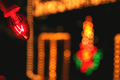
Clarity2.jpgby JennAppleComment by macrothing: '4', maybe '5', had you entered this. I was interested in seeing this for the potential, as I said in my comments in the real entry (which I gave a 2). Obviously looks a lot better at this size, but the 'clarity' and contrasting lights against the 'pure black' that was in the smaller size, doesn't seem to be as strong in this. There seems to be a slight 'haze' (difficult to explain). I like (again as I said before) the potential here, the composition is good with the bulb in the corner and the unusual 'lined/patterned bokeh' in the background is good. If the bulb were a fraction more in the frame, 'sharper' (especially re your title) and some 'tweaking' of the overall color/contrast, trying to get the black more 'pure', would have made this even better in my opinion. Also, for a 'Free Study', it was always going to be a 'different horse in the race' against so many other more 'classic' photography shots, if that makes sense. Thank you for posting this version. edit:typo Message edited by author 2005-12-17 22:16:00. |
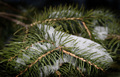
| 12/15/2005 04:20:53 PM |
Frosty Forksby JennAppleComment by macrothing: Gave this a 4. Thought it had a little more potential than you captured. I liked the concept and the snow/ice gave an extra element. Perhaps just a little too close, resulting in focus issues, but I realize you were likely trying to capture the snow/ice as well, so difficult. Apologies in advance if wrong, but does seem like you may have used a flash with this, so the 'burning' on the outer edges emphasized that, so perhaps without the burning may also have made this better in my opinion. edit:removed temporary note re sizing Message edited by author 2005-12-17 17:45:22. |
 Photographer found comment helpful. Photographer found comment helpful. |
| 12/11/2005 03:26:44 PM |
|
| 12/08/2005 04:12:42 PM |
Clarityby JennAppleComment by macrothing: You are a member - I'd be interested in seeing this at 640 width (if possible) posted in your portfolio. I like the colors and think it has potential bigger. edit: thank you for posting the other version, I left a comment Message edited by author 2005-12-17 17:43:38. |
| Photographer found comment helpful. |
| 12/07/2005 10:16:15 PM |
Clarityby JennAppleComment by kenskid: Hmm....needs to be bigger so we can see more detail. I would also try to get a little "wider" on the background. |
| 12/07/2005 03:20:36 PM |
|
| 12/07/2005 11:35:15 AM |
Clarityby JennAppleComment by srdanz: Oh, size... but you know that by now. The lightbulb in teh top left corner is in focus, but it hardly occupies enough of the image to complement the huge area of OOF lights. The idea for the study is good, and I am not scoring this low just because it is blurry - rather because it failed to use the blur in a eye-pleasing manner (at least in my opinion). |
| 12/06/2005 11:30:38 PM |
|
| Photographer found comment helpful. |
| 12/06/2005 08:44:53 PM |
|
| Photographer found comment helpful. |
| 12/05/2005 10:27:43 AM |
|
Home -
Challenges -
Community -
League -
Photos -
Cameras -
Lenses -
Learn -
Help -
Terms of Use -
Privacy -
Top ^
DPChallenge, and website content and design, Copyright © 2001-2025 Challenging Technologies, LLC.
All digital photo copyrights belong to the photographers and may not be used without permission.
Current Server Time: 03/13/2025 05:02:58 AM EDT.