| Image |
Comment |
| 09/13/2006 11:21:03 AM |
|
 Photographer found comment helpful. Photographer found comment helpful. |
| 09/11/2006 02:14:22 PM |
Surpriiiiiiise !!!!by SimpaComment by atupdate: Back to comment: Sorry to be so blunt but this image doesn't really convey Simple Pleasures to me. On the technical side, your image has a couple of compositional issues that could be improved. First, the cropping is a little tight to the scarecrow's hat at the top of the image. Second, the placement of the scarecrow should be more to the left so it is looking into the negative space in the image instead of away from the negative space. I suggest you review the winning images in the Rule of Thirds challenge to get a better feel for subject placement. |
| Photographer found comment helpful. |
| 09/11/2006 09:33:28 AM |
|
| Photographer found comment helpful. |
| 09/09/2006 06:29:43 PM |
|
| Photographer found comment helpful. |
| 09/07/2006 12:58:58 PM |
|
| Photographer found comment helpful. |
| 09/07/2006 06:36:35 AM |
|
| Photographer found comment helpful. |
| 09/06/2006 01:23:20 AM |
|
| Photographer found comment helpful. |
| 07/29/2006 02:38:02 PM |
|
| Photographer found comment helpful. |
| 07/25/2006 04:25:10 PM |
|
| 07/25/2006 01:55:33 PM |
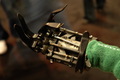
Hand linesby SimpaComment by levyj413: If the subject is the hand, then I suggest having it in sharp focus; even the slight blur here really diminishes the impact of the lines.
And then get rid of the blurry stuff in the back - it draws my eye away from the hand.
Sharp focus, nothing else visible, and the hand in just that spot, and I'd give this a better score. |
Home -
Challenges -
Community -
League -
Photos -
Cameras -
Lenses -
Learn -
Help -
Terms of Use -
Privacy -
Top ^
DPChallenge, and website content and design, Copyright © 2001-2025 Challenging Technologies, LLC.
All digital photo copyrights belong to the photographers and may not be used without permission.
Current Server Time: 04/12/2025 12:25:55 PM EDT.