| Image |
Comment |
| 11/28/2005 09:40:18 PM |
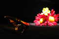
War and Peaceby teemuoComment by dsa157: good idea, but the lighting is pretty uneven. The bullets are too dark and the top flower is overexposed and over saturated. |
| 11/28/2005 07:54:15 PM |
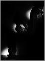
Soldier Cut in Threeby teemuoComment by suprada: Hi!
Greetings from the Critique Club!
About the photo, first let me state the obvious...the photo does seem to be too dark to make out the details. With what details I can see (after increasing the brightness of my monitor), it is surely an interesting photograph.
Technically, I would like to see the photo a bit more sharp. The lighting with the torch seems abrupt...I wonder if it could have been made more seamless... I assume that the flashlight was first focussed on the feet, then on the hands with the rifle and then the face. The bright spot to light the face overlaps the shoulder part of the midsection. In my opinion, placing the hand and rifle part lower would help and balance out the light spot positions and make them symmetric along the anti-diagonal. Also some more space on the right edge would help with the photo balance.
All said and done, its a nice photo. To me it symbolizes the before, now and after of a soldiers life. Well done and keep shooting. Hope to see more great work from you.
-- Suprada |
 Photographer found comment helpful. Photographer found comment helpful. |
| 11/28/2005 04:09:07 PM |
War and Peaceby teemuoComment by denisk: Though you put the focus on the 'war' part, such a shame. Also that the flowers are blown out. |
| 11/27/2005 01:20:03 AM |
|
| Photographer found comment helpful. |
| 11/24/2005 07:33:54 AM |
War and Peaceby teemuoComment by temba: It may be my monitor granted, but the item on the left of this shot is too dark for me to make out. Add to that the soft, distance focus on the flowers and sadly this image just hasn't fulfilled its potential to my eyes. I also have a hard time getting the link with odd. |
| 11/24/2005 05:29:55 AM |
|
| 11/23/2005 12:14:08 PM |
|
| 11/23/2005 07:25:17 AM |
|
| 11/23/2005 06:09:04 AM |
Soldier Cut in Threeby teemuoComment by teemuo: The problem with this image was simple. My laptops monitor shows everything too light. So when I tuned the curves on this one, it got way too dark. It is a shame, because I think more people would have liked this one if it was lighter.
Thanks for everyone for commenting, this was my first picture on the DPC and got lot of comments. :)
|
| 11/23/2005 03:19:08 AM |
War and Peaceby teemuoComment by Mel34: Yes...veery odd to connect war and peace at times!
This is very dramatic and I love that! |
Home -
Challenges -
Community -
League -
Photos -
Cameras -
Lenses -
Learn -
Help -
Terms of Use -
Privacy -
Top ^
DPChallenge, and website content and design, Copyright © 2001-2025 Challenging Technologies, LLC.
All digital photo copyrights belong to the photographers and may not be used without permission.
Current Server Time: 03/12/2025 03:14:42 PM EDT.