| Image |
Comment |
| 09/08/2007 11:51:28 PM |
Stalemateby ryandComment by garrywhite2: Ryan I like this shot, quite good technically and creative. I didn't vote on it but I would have given it a 6+. |
 Photographer found comment helpful. Photographer found comment helpful. |
| 09/08/2007 04:05:14 PM |
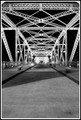
Crosswalkby ryandComment by garrywhite2: I like this symmetry in this image. The truses in the distance appear slightly out of focus but I think that has more to do with position and lighting, than aperture. If you shot that at f8 and 24mm as long as you focused on something more than 12' away, the depth of field should have been sufficient.
Would like to see the color version. |
| Photographer found comment helpful. |
| 09/08/2007 02:15:27 PM |
|
| Photographer found comment helpful. |
| 09/08/2007 02:04:56 PM |
Crosswalkby ryandComment by sfalice: I agree with the others on the crop. A crop at the edge of the last diagonal pavement line brings you right into the image. Then, a little housecleaning to get rid of specks and the tiny bit of litter would help, and finally, since this was expert editing (advance editing would work for this suggestion too) try selecting the roadway and perhaps sidewalks and apply some Neat Image or Noise Ninja. Bet you'll like it.
(I confess to voting this one a 5 as well...) |
| Photographer found comment helpful. |
| 09/08/2007 12:28:02 PM |
Crosswalkby ryandComment by cpanaioti: The leading lines of the trusses and repeating pattern is good to draw the viewer into the image. However, the large amount of empty space at the bottom of the image adds nothing. Cropping out the part below the benches I think would give the image much more impact.
I probably would have given it a 5 in the challenge. If foreground cropped out then a 6. |
| Photographer found comment helpful. |
| 09/08/2007 12:11:40 PM |
Crosswalkby ryandComment by Ann: I gave this a 6. I like the repetitive graphical pattern, and the sharpness on the parts that are close to the camera. As for flaws, I have the same basic comments as the others. I think one of the problems is that you're using f/8, which isn't a small enough aperture for the distant areas to really be in focus. f/11 or f/16 would have been better, and your exposure time would still have been reasonable. Like the others, I would have cropped off the bottom 1/4 of the shot, up to the point where the sidewalks come in from the sides. That would have put the convergence point closer to 1/3 of the way from the top, and it would have looked more balanced. |
| Photographer found comment helpful. |
| 09/08/2007 11:38:59 AM |
Crosswalkby ryandComment by smurfguy: Being expert editing (or even advanced), I might have cloned out some of the bright/dark specs on the road - I find them a bit distracting. It probably wouldn't have made a difference, but just a thought... =) |
| Photographer found comment helpful. |
| 09/08/2007 11:31:48 AM |
Crosswalkby ryandComment by alanfreed: I gave it a 5 also, for many of the reasons others have stated. I think the biggest factor is that it just doesn't have a lot of "wow" to it. It's a technically fine shot, but there's no real zing to push the vote up higher. |
| Photographer found comment helpful. |
| 09/08/2007 11:29:25 AM |
Crosswalkby ryandComment by levyj413: Hi. I'm responding to you request for critiques in your thread.
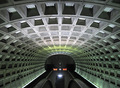
I agree with the other post-challenge commenters. Try cropping so the bottom just touches the triangular shadow. That will create two triangles - a light one coming from the right and the dark one coming from the left. It also pulls the eye into the frame because the bridge comes diving down from the top of the frame. I used similar framing for one of my subway shots:
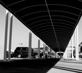
This bridge has loads of potential. Go back and play around with many different angles. For example, try shooting where the vanishing point isn't centered horizontally:
Don't get discouraged by the score. "Average" on DPC usually means a good shot to anyone else. |
| Photographer found comment helpful. |
| 09/08/2007 11:05:50 AM |
Crosswalkby ryandComment by Neil: I gave you a 5 on this, here's why: these shots work when they give a sense of depth and symmetry. The negative effect applied here doesn't give me the feeling of depth at all. Whereas in positive mode, there may have been more visual cues to depth (that we are used to seeing). Also, the tight vertical crop where the beams end, and spacious foreground don't put me "in the scene".
Hope that helps. |
| Photographer found comment helpful. |
Home -
Challenges -
Community -
League -
Photos -
Cameras -
Lenses -
Learn -
Help -
Terms of Use -
Privacy -
Top ^
DPChallenge, and website content and design, Copyright © 2001-2025 Challenging Technologies, LLC.
All digital photo copyrights belong to the photographers and may not be used without permission.
Current Server Time: 04/19/2025 05:51:47 AM EDT.