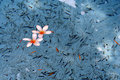
DPChallenge: A Digital Photography Contest You are not logged in. (log in or register
 
Browse Settings
Currently viewing:
Registered UserTajhad

Show comments:

Per page:

Order:

Comments:


Comments Received by Tajhad
Pages:   ... ...
Showing 301 - 310 of ~426
Image Comment
Artist Inspiration
09/26/2006 09:15:44 AM
Artist Inspiration
by Tajhad

Comment by talj:
A beautiful capture. Lovely DOF, the composition IMHO is excellent. You have caught a great expression of interest and concentration on the ladies face. Well done :o)
Photographer found comment helpful.
Old Wine
09/26/2006 09:13:58 AM
Old Wine
by Tajhad

Comment by talj:
Love the light on the house and how you have placed the stakes in the frame really help to lead the viewer into the image. The only thing I would have liked is a bit more detail in the foreground :o)
Photographer found comment helpful.
Life on the streets
09/26/2006 09:11:52 AM
Life on the streets
by Tajhad

Comment by talj:
I like the crop, works really well. I am not too sure about the soft/blurry look to some parts of the photo but feel the editing you have done with the colours has added a new aspect to the overall image and I like it :o)
Photographer found comment helpful.
Life on the street - original
09/26/2006 09:10:36 AM
Life on the street - original
by Tajhad

Comment by talj:
I really like this but would like to see the man a bit more close up to get more of his expression in. I do like the colours of the bench but find the background a little busy.
Photographer found comment helpful.
Artist Inspiration
09/16/2006 11:27:02 AM
Artist Inspiration
by Tajhad

Comment by Jutilda:
Very nice. Great focus and color control. Perfect DOF as well.
Photographer found comment helpful.
water-1.jpg
09/12/2006 06:18:01 PM
water-1.jpg
by Tajhad

Comment by LucidLotus:
First, when I looked through your portfolio I noticed a number of interesting images but the one that grabbed my attention was this one.

I absolutely love the color combinations here. The blue is soft and cooling and the sparks of orange really add a smooth contrast, finishing off with the punch of white. I could easily see this as a Zen entry.

I thik the lighting here is good. You've managed to get some dappled lighting on the water in areas and the flowers look well lit as well. I really like the fact that there is also a shadow across the water as that keeps the image from being too sparkly and bright, allowing the colors to work together and not be overpowered. Some might find the shadows distracting since they are not stretching across the entire image, but I'd disagree and think it adds a nice dimension and another area of contrast for the viewer to explore.

The focus looks excellent, the flowers are well defined and the little bits floating with them are easily seen. That said it looks like there may be a bit too much sharpening. I don't know if that's the case, but some of the floating bits feel extra contrasty and I tend to see that when I start to sharpen things too much. There's a bit of haloing around some of them too which is noticeable when you're really examining the photo. Perhaps a re-process that addressed this?

I think the composition is perfect. I really wouldn't change anything at all. The position of the flowers is off-center which adds a bit of drama. Though there are clearly bits floating around and darker bits on the bottom of the pool aka background, it still retains a feeling of negative space for me, which helps isolate those flowers and makes them pop even more. I love the background here as well. In another image it may seem much too busy, but I think it works extremely well and adds a foil for the crisp, cleaner colors the floating items create.

I do wonder how adding a thicker black border around this would look, I think it would smarten it up just a bit, giving us an edge that keeps our eyes in and framing the whole piece nicely. I don't think the image requires a border by any means, but I think this is one where the border (providing you chose a good color - i.e. not white!) would be a positive supporting item rather than a detraction.

I could very easily see this as a print on someone's wall, with or without a border added!
Photographer found comment helpful.
Old Wine
08/25/2006 10:41:22 AM
Old Wine
by Tajhad

Comment by Tajhad:
Thanks Germaine
I wasn't a 100% sure about this one. Played with it a bit. Thanks for your comments.
Old Wine
08/25/2006 10:37:44 AM
Old Wine
by Tajhad

Comment by Germaine:
Out-of-the-ordinary composition and textures with the stakes marching up to the house, the horizontal line of the house itself, and then those stone buttresses. Love the yellow house against the gray-blue sky.

Message edited by author 2006-08-25 10:43:15.
Photographer found comment helpful.
"Found it !"
08/17/2006 11:20:59 PM
"Found it !"
by Tajhad

Comment by Fayea:
nice exposure, kinda dreamy
Photographer found comment helpful.
"Found it !"
08/16/2006 11:29:47 PM
"Found it !"
by Tajhad

Comment by Louison:
:o)
Pages:   ... ...
Showing 301 - 310 of ~426


Home - Challenges - Community - League - Photos - Cameras - Lenses - Learn - Help - Terms of Use - Privacy - Top ^
DPChallenge, and website content and design, Copyright © 2001-2025 Challenging Technologies, LLC.
All digital photo copyrights belong to the photographers and may not be used without permission.
Current Server Time: 04/08/2025 09:20:35 PM EDT.