| Image |
Comment |
| 03/31/2004 03:48:36 AM |
|
| 03/31/2004 01:35:02 AM |
Waropolyby PaulkComment by hgpayne: SOMEBODY went to a lot of effort for a non-profit challenge :)
But "out of place..." hmm. The only thing in this photo as presented that is "out of place" is the $20 when properties are selling for billions. I guess the tank playing piece is too big for the game as well. |
| 03/31/2004 12:28:42 AM |
Waropolyby PaulkComment by e301: Strange picture: terribly well executed, technically of course, and I like the detailing both of shot and of set-up, in that cards and stuff. Did you make that monopoly board? Or are they actually so utterly insensitive that it is produced commercially? I wouldn't put it past some people ... but I think it must be your own work - terribly convincing. Overall, however, the image is a touch disorganised, which dilutes its impact - and in fact, I think it's too dependent on text for it's real moments of fun. |
 Photographer found comment helpful. Photographer found comment helpful. |
| 03/30/2004 05:28:41 AM |
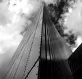
To the Stars by PaulkComment by floyd: It's not like me to complain about applicability to the challenge but surely this is more "converging lines" than parallel? Regardless it's a great atmospheric shot and well worthy of recognition. |
| 03/29/2004 02:43:37 AM |
To the Starsby PaulkComment by Aden: I am a great fan of color. There is a total lack of blue in this photo.Of all colors there should be blue,
The angle is great. Composition is OK. But there is no color.You lose points because you do not intagrate color as an aspect of your composition. While B&W can be a strong format, you fail to see that there is a pervading color cast that would give a sense of motion to your picture. |
| 03/28/2004 08:44:15 PM |
To the Starsby PaulkComment by tyt2000: Congrats on your second ribbon in a row. This structure/building has so much power to it, the perspective and tone really enhance that. Did you worry about the slight tilt to the right? Just curious.
Good luck in your next challenges...
- Thamer |
| Photographer found comment helpful. |
| 03/27/2004 08:06:46 AM |
To the Starsby PaulkComment by Paulk: Thanks for all the great comments
you wait all year for a ribbon and then two come along at once
I doubt that my entry for "out of place" will score high and I'm bracing myself for the comments
By the way " to the stars " post shot editing would have passed the basic rules it was converted to B/W and the contrast increased |
| 03/27/2004 01:42:32 AM |
To the Starsby PaulkComment by La-Luna: Congratulations Paul!!!! a well deserved blue ribbon for you:)) and I'm impressed... two blues in a row!!! |
| Photographer found comment helpful. |
| 03/26/2004 07:48:18 PM |
|
| Photographer found comment helpful. |
| 03/26/2004 12:28:44 AM |
To the Starsby PaulkComment by zmaerd: The clouds look fake to me, something of the sort of "Difference Clouds" as produced with Photoshop. Maybe not, but it just looks like it could have been rendered rather than captured. Not to offend, just to question the possibility. I liked this image, the clouds just gave me a 2nd guess. Regardless, congrats on the win and the numerous other wins under your belt. You've definitely got a good thing going. |
Home -
Challenges -
Community -
League -
Photos -
Cameras -
Lenses -
Learn -
Help -
Terms of Use -
Privacy -
Top ^
DPChallenge, and website content and design, Copyright © 2001-2025 Challenging Technologies, LLC.
All digital photo copyrights belong to the photographers and may not be used without permission.
Current Server Time: 04/21/2025 10:05:17 PM EDT.