| Image |
Comment |
| 03/01/2006 12:46:35 AM |
|
| 02/28/2006 09:43:24 PM |
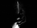
The Beast Withinby balmikiComment by arnit: Critique by arnit
I like the black negative space. In my opinion the lighting could have been better. The burned out hand bother me a bit because that is the first thing that I see and my eyes keep on moving to that spot. I would like to see a bit more light on his face and on the blade. Maby the whole right side of him lit. Good luck in future challanges.
Arnit
Critique Club |
| 02/27/2006 08:31:45 PM |
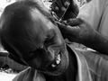
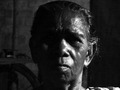
The Faceby balmikiComment by phayanak: what a shame it cold have been a great picture, but for some reason it just looks like a quick snap shot ... should have been more in focus and perhaps less noise in the background .... also it's rather dark |
| 02/26/2006 05:35:52 PM |
|
| 02/25/2006 10:25:22 PM |
The Faceby balmikiComment by msieglerfr: Good, but the picture is too dark for my taste. Maybe a zoom on his face would have enhanced the picture. 6 |
| 02/25/2006 09:49:04 PM |
The Faceby balmikiComment by BakerBug: Would be better if there were more light. More than half the face is hidden by shadows. |
| 02/24/2006 02:21:23 PM |
The Faceby balmikiComment by oanav: excellent subject and the light suits the face... would have deserved a better composition |
| 02/24/2006 09:46:16 AM |
|
| 02/24/2006 08:43:24 AM |
|
 Photographer found comment helpful. Photographer found comment helpful. |
| 02/23/2006 06:14:40 PM |
The Faceby balmikiComment by tph1: He has an intersting face. I would have liked to see it more clearly. |
Home -
Challenges -
Community -
League -
Photos -
Cameras -
Lenses -
Learn -
Help -
Terms of Use -
Privacy -
Top ^
DPChallenge, and website content and design, Copyright © 2001-2025 Challenging Technologies, LLC.
All digital photo copyrights belong to the photographers and may not be used without permission.
Current Server Time: 04/26/2025 06:58:15 PM EDT.