| Image |
Comment |
| 04/11/2006 04:00:37 PM |
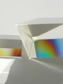
table of enlightenmentby fencekickerComment by adrian45: Subtle colours, I suspect a bit of Polarising here, but I may be wrong
Nice restrained contrast, and all the facets are displayed. I think I would be tempted to enhance the colour in this shot, and boost contrast in the two colour panels to push the idea a bit more
Good luck with your very nice image |
 Photographer found comment helpful. Photographer found comment helpful. |
| 04/10/2006 09:34:09 AM |
|
| 04/08/2006 09:20:09 PM |
|
| Photographer found comment helpful. |
| 04/05/2006 11:37:31 AM |
|
| 03/29/2006 09:49:34 PM |
|
| Photographer found comment helpful. |
| 03/28/2006 07:06:06 PM |
Taking Timeby fencekickerComment by ticktockdoc: A little soft. Perhaps seeing the hands in a different position such as 4:10 may have conveyed a better image of the clock. |
| Photographer found comment helpful. |
| 03/25/2006 09:35:49 AM |
Taking Timeby fencekickerComment by Grahve: Not sure that the composition quite works for me. It may be better if we could see more of the clock and the hand of the clock. Good idea though |
| Photographer found comment helpful. |
| 03/24/2006 10:58:24 AM |
Taking Timeby fencekickerComment by GrayGhost: Nice idea. Nice duotone choice, but overall image feels too midtone - please consider adjustment to brighter levels. |
| Photographer found comment helpful. |
| 03/23/2006 10:59:59 PM |
|
| Photographer found comment helpful. |
| 03/23/2006 08:35:42 AM |
Taking Timeby fencekickerComment by glad2badad: Well, it's different. Wish the hand was in focus instead of the clock - or maybe both with more DOF would be best yet. Lighting could be stronger (yet diffused), and a polarizer would reduce some glare on the clock face glass. Compositionally, it's too tight. Need a little breathing room for the subject. I like how you used a black background. Good luck in the challenge. |
| Photographer found comment helpful. |
Home -
Challenges -
Community -
League -
Photos -
Cameras -
Lenses -
Learn -
Help -
Terms of Use -
Privacy -
Top ^
DPChallenge, and website content and design, Copyright © 2001-2025 Challenging Technologies, LLC.
All digital photo copyrights belong to the photographers and may not be used without permission.
Current Server Time: 04/01/2025 11:22:28 PM EDT.