| Image |
Comment |
| 05/09/2006 07:52:34 AM |
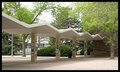
Roof Waveby jentComment by MrXpress: The rhythm part is fairly good, but the image itself is devoid of any pop and lacks sharpness |
 Photographer found comment helpful. Photographer found comment helpful. |
| 05/07/2006 06:27:50 AM |
Roof Waveby jentComment by gdanie11: The lighting is very soft and even which tends to make this shot a little flat....more shadows might help emphasis the canopy. |
| Photographer found comment helpful. |
| 05/06/2006 11:55:49 PM |
|
| Photographer found comment helpful. |
| 05/06/2006 11:41:33 AM |
Trees of Knowlageby jentComment by moniepenny: Seems a little crooked to me, and you spelled knowledge wrong, which kind of takes away from the presentation to me. |
| Photographer found comment helpful. |
| 05/05/2006 09:02:48 PM |
Roof Waveby jentComment by hopnjohn: Yes, you have rhythm going on. The focus is a little soft and the columns are distracting with all those posters on them. I wonder if a lower angle, facing upward and most of the columns cropped out would have been better. |
| Photographer found comment helpful. |
| 05/05/2006 07:32:58 PM |
|
| Photographer found comment helpful. |
| 05/05/2006 06:32:08 AM |
Trees of Knowlageby jentComment by JunieMoon: Need better focus. There is also something wrong on the walkway. It seems to be very unevenly exposed and color seems to not match the scene all that well. Anyway, the topic needs work as well. Maybe zooming in on the columns with steps leading to them would make a better image. Trees did not add to the overall theme of the image. |
| Photographer found comment helpful. |
| 05/05/2006 01:59:32 AM |
Trees of Knowlageby jentComment by GuGi: Photograph seems to be tilting a little to the right and I wish there was better focus on the building as it is the center of this shot |
| Photographer found comment helpful. |
| 05/04/2006 05:36:39 AM |
Trees of Knowlageby jentComment by Mambe: You maybe should have rotate it a bit to straighten the photo.
If your intention was to center the attention upon the trees , a vertical(portrait) shot could have been more stunning or maybe just if you'd have took this one showing more the branches of the trees.
What I don't like in this photo is the white/greyish square , it seems like you "paint" it , all the path look unreal. |
| Photographer found comment helpful. |
| 05/04/2006 12:53:43 AM |
|
Home -
Challenges -
Community -
League -
Photos -
Cameras -
Lenses -
Learn -
Help -
Terms of Use -
Privacy -
Top ^
DPChallenge, and website content and design, Copyright © 2001-2025 Challenging Technologies, LLC.
All digital photo copyrights belong to the photographers and may not be used without permission.
Current Server Time: 04/10/2025 11:50:40 AM EDT.