| Image |
Comment |
| 05/17/2006 08:06:41 PM |
|
 Photographer found comment helpful. Photographer found comment helpful. |
| 05/17/2006 02:31:04 PM |
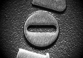
No Entryby jimnessComment by freakin_hilarious: My favorite so far...very well done. Good job seeing something so different and capturing it perfectly. I didn't even realize that I recognized that symbol until I saw the title. I'll never look at that "o" the same way again. |
| Photographer found comment helpful. |
| 05/17/2006 01:30:16 PM |
No Entryby jimnessComment by Bullie: Very original for this challenge! I think this couldn't be any more perfect! |
| Photographer found comment helpful. |
| 05/17/2006 09:46:09 AM |
|
| Photographer found comment helpful. |
| 05/17/2006 08:38:07 AM |
|
| Photographer found comment helpful. |
| 05/17/2006 06:57:14 AM |
|
| Photographer found comment helpful. |
| 05/17/2006 06:47:48 AM |
|
| Photographer found comment helpful. |
| 05/17/2006 05:32:02 AM |
|
| Photographer found comment helpful. |
| 05/16/2006 11:11:55 AM |
Groovyby jimnessComment by ellamay: Greetings from the CC, I am really not too sure how to comment on your shot. While nothing strikes me as 'wow' there is not really anything clearly 'wrong' either. I guess depending on the purpose of the shot it lacks a little 'umph'. I like the tones of the lines and I like the curve to it. Perhaps it would of increased the visual image if you left the image higher on the top so that there was more black space creating a 1/3 lines, 2/3 darker area? Just a thought. The more I look at it the more I can see the lines in it relating to 12", I wonder too if taking the image from a different angle may have made it easier to distinguish.
Keep up the efforts! |
| Photographer found comment helpful. |
| 05/10/2006 05:10:09 AM |
Groovyby jimnessComment by jimness: Maybe I should have made the subject more obvious - I realised as soon as I posted it that comments aren't displayed during voting! Well, we live and learn... |
Home -
Challenges -
Community -
League -
Photos -
Cameras -
Lenses -
Learn -
Help -
Terms of Use -
Privacy -
Top ^
DPChallenge, and website content and design, Copyright © 2001-2025 Challenging Technologies, LLC.
All digital photo copyrights belong to the photographers and may not be used without permission.
Current Server Time: 04/07/2025 12:09:55 AM EDT.