| Image |
Comment |
| 06/16/2006 03:46:40 AM |
Shades of Summerby dannyleeComment by redmoon: i actually like this one quite a lot. i gave it an 8 - i like it's subtlety, and the bright friendly colours... would have also been a good entry in the recent compementary colours challenge. i think it demonstrates great creativity, and you've found shadow in a place i would not have even thought of. it looks so invitingly lovely! and it would look great in a holiday brochure. well done and good luck with this! |
 Photographer found comment helpful. Photographer found comment helpful. |
| 06/15/2006 06:38:23 AM |
Shades of Summerby dannyleeComment by Judi: Good angle....maybe a small subject like a hat or sunglasses on one of the mats would give the viewer a focal point. |
| Photographer found comment helpful. |
| 06/14/2006 11:43:36 PM |
Shades of Summerby dannyleeComment by neophyte: I really like the color contrast and the geomtric design in this. Colored shadows are cool too. Reflection on floats detract a bit. |
| Photographer found comment helpful. |
| 06/13/2006 10:04:47 AM |
|
| Photographer found comment helpful. |
| 06/12/2006 07:20:15 PM |
|
| Photographer found comment helpful. |
| 06/12/2006 04:35:48 PM |
|
| Photographer found comment helpful. |
| 06/12/2006 12:21:06 AM |
|
| Photographer found comment helpful. |
| 06/10/2006 12:25:01 PM |
|
| 06/06/2006 05:11:50 PM |
|
| 06/06/2006 05:05:57 PM |
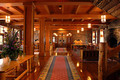
The Lodge, 1917by dannyleeComment by L1: Greetings from the Critique Club! :)
This is a very lovely image...warm and inviting. I love the lighting and the whole range of colors present. Technically it is very well-done, focus is sharp, contrast is good. Your picture is very well composed...the rugs seem to lead you right through the middle and into the back. At first glance, I thought I'd rather see it follow more of the rule of thirds, but as I study it more and more I think the central composition is the best choice for this particular shot.
The fact that it does lead you right through to a doorway and wall is both good and bad. I can understand that it doesn't really lead to a specific point of interest, but then again, there are some shots that just really don't have or need a major focal point, as the entire image is a focal point on the whole. I can see this working well for stock or for a magazine spread.
Again, I think it's lovely and the score seems appropriate for this challenge. I'm sure voters were looking for more "wow" than this kind of serenity and substance.
Keep shooting and if you have any questions let me know. :)
Take care,
Laurie
Critique Club :)
|
| Photographer found comment helpful. |
Home -
Challenges -
Community -
League -
Photos -
Cameras -
Lenses -
Learn -
Help -
Terms of Use -
Privacy -
Top ^
DPChallenge, and website content and design, Copyright © 2001-2025 Challenging Technologies, LLC.
All digital photo copyrights belong to the photographers and may not be used without permission.
Current Server Time: 04/11/2025 07:42:04 PM EDT.